Media
Make Your Own Movie
If your at-home film fest leaves you inspired, jump in, and make your own animated show using just supplies you have around the house. Curator of Education, Gina Thomas McGee shows you how here:
If your house is anything like mine, there has been a lot more screen time than normal. With this project, you’ll create your own no-tech moving picture show using supplies you have around the house (or recently thrown into the recycle bin). Here’s how:

Supplies:
Cereal box
Two paper towel tubes
Paper (small enough to fit in the box, see below)
Tape
Markers, crayons, or any drawing supplies you have
Photo of someone in your family (or a drawing instead)
How To:
Trim your paper to fit inside your box. I had to cut a little bit off of the top and bottom of standard 8.5×11” printer paper to fit inside the cereal box when laid horizontally.
Draw your scenes! Create as many background scenes as you like using your drawing tools. My four year old and I collaborated on ours. Train stations, the beach, anything goes!

Tape all of the scenes together (tape on the short side of the paper).

Cut a square out of the front of your cereal box slightly smaller than the dimensions of your paper. Cut holes for your paper towel tubes. You’ll need a top and bottom hole for each tube on either side of the box. See photos.
Slide your tubes into the holes. After they’re in, you may want to secure the box opening with tape, so it is a bit stronger.
Tape one end of your now taped-together scenes onto one of the paper towel rolls.
Roll the drawings onto the tube by spinning it around until you get to the other end of your drawings.
Secure the other end of your drawings to the other tube.
Finally, cut out a photo or drawing of someone in your family. Give it some extra support with a little cardboard or a plastic straw on the back so it stands upright.
Tape the photo to the bottom of your ‘screen’ opening, so it looks like the person is in the scene.
Decorate the outside of the box if you wish.

START THE SHOW!
Move the scenery by rotating one of the paper towel tubes. You’re essentially wrapping your drawings around the tube like a roll of paper towels. When you get to the end, go backwards by rotating the other tube.
Narrate the story, film your creation, share with friends, make more characters, have fun!
VIDEOS:
https://photos.app.goo.gl/xJraPvPxvTCzGzg89
Studio Hours are made possible with support from PNC, the Mary S. and David C. Corbin Foundation, the Alan and Janice Woll Family Fund, OMNOVA Solutions Foundation, Peg’s Foundation, Robert O. and Annamae Orr Family Foundation, Kathy Moses Salem Philanthropic Fund of the Akron Community Foundation, Charles E. and Mabel M. Richie Foundation and Mr. and Mrs. William H. Considine.

Final Studies: Steven Mentzer
Undergraduate Student, Oberlin College
Studio Art
Title of Exhibition: A Untitled Nature
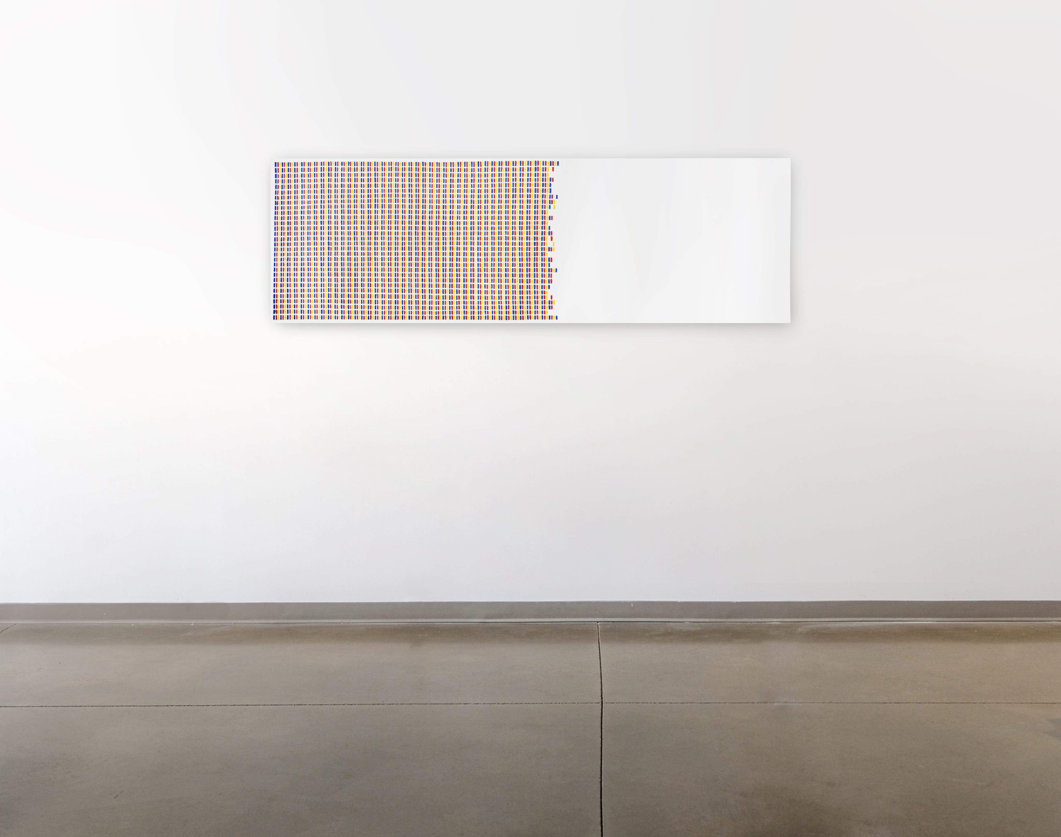

I substantiate the nominal units of art. the individual gestures, minimal acts, and influences on material that often erase and obscure themselves as they are produced. These actions require repetition to substantiate the worth of the collective whole rather than existing as standalone intentions of art.
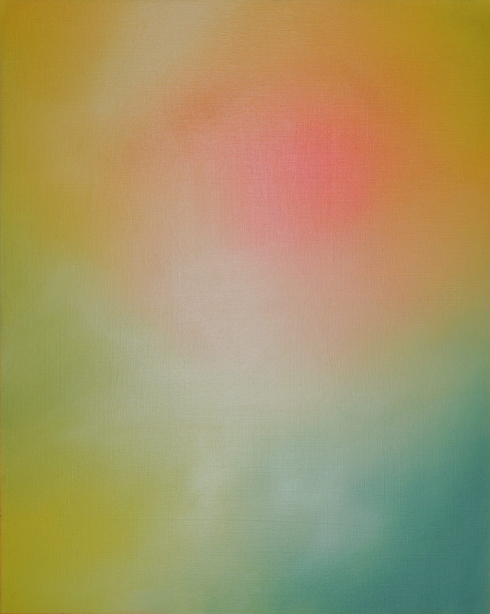
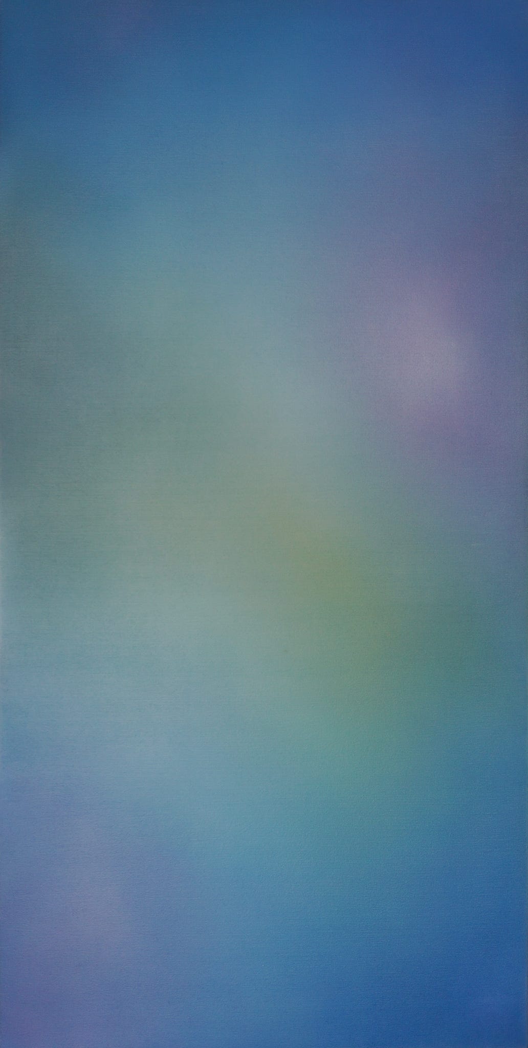
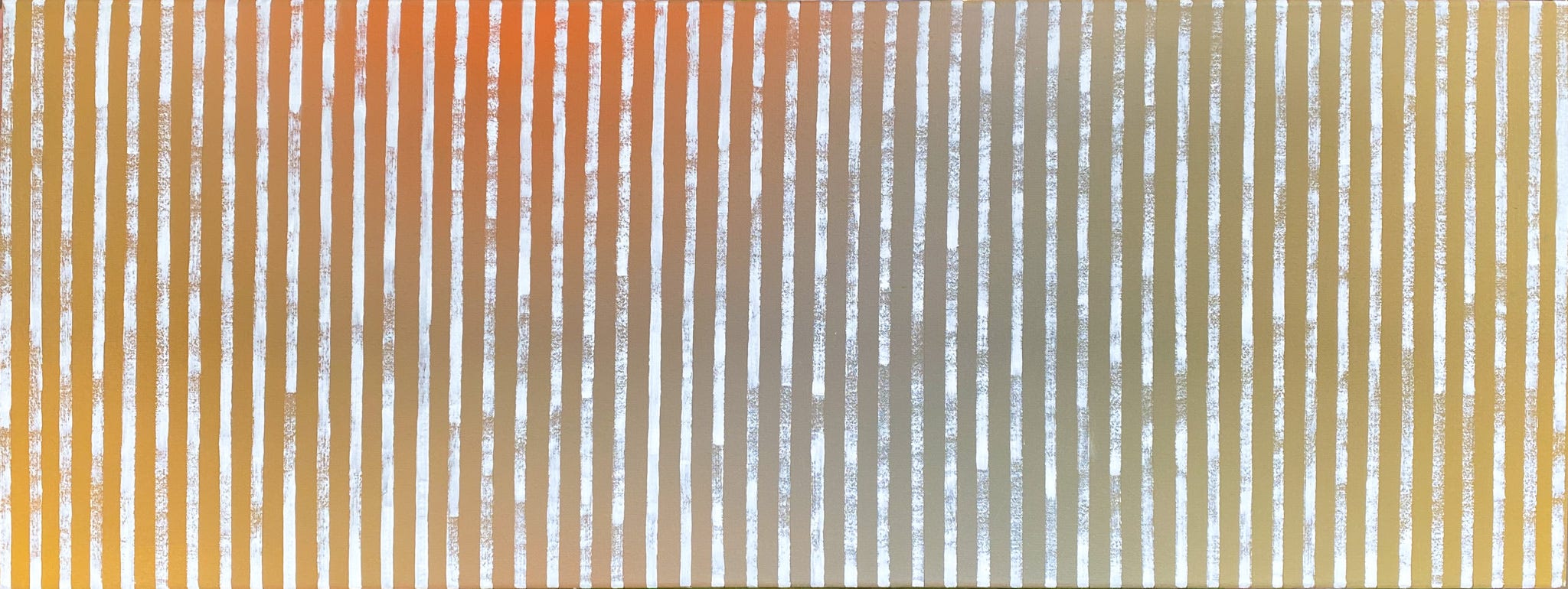

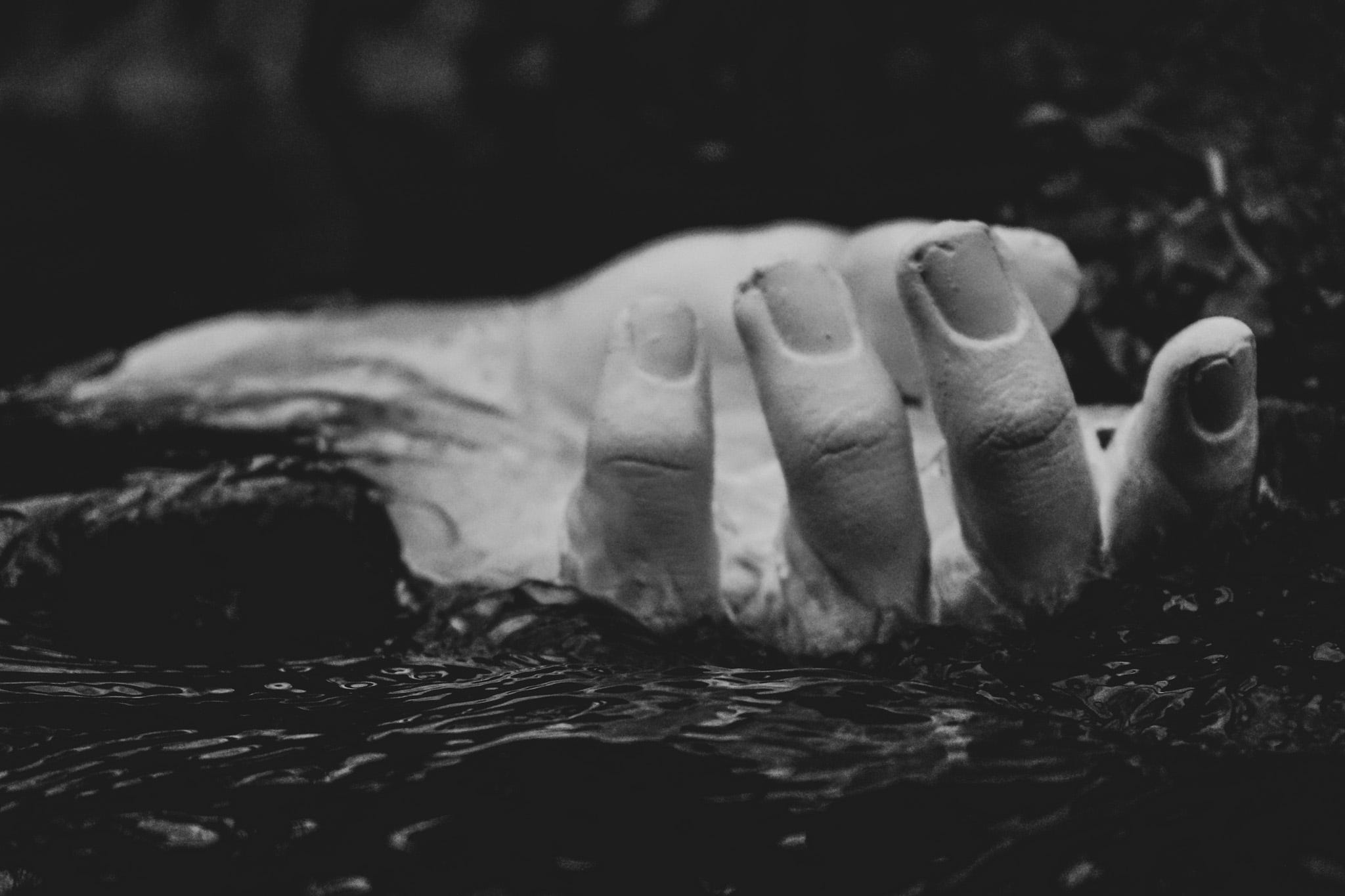
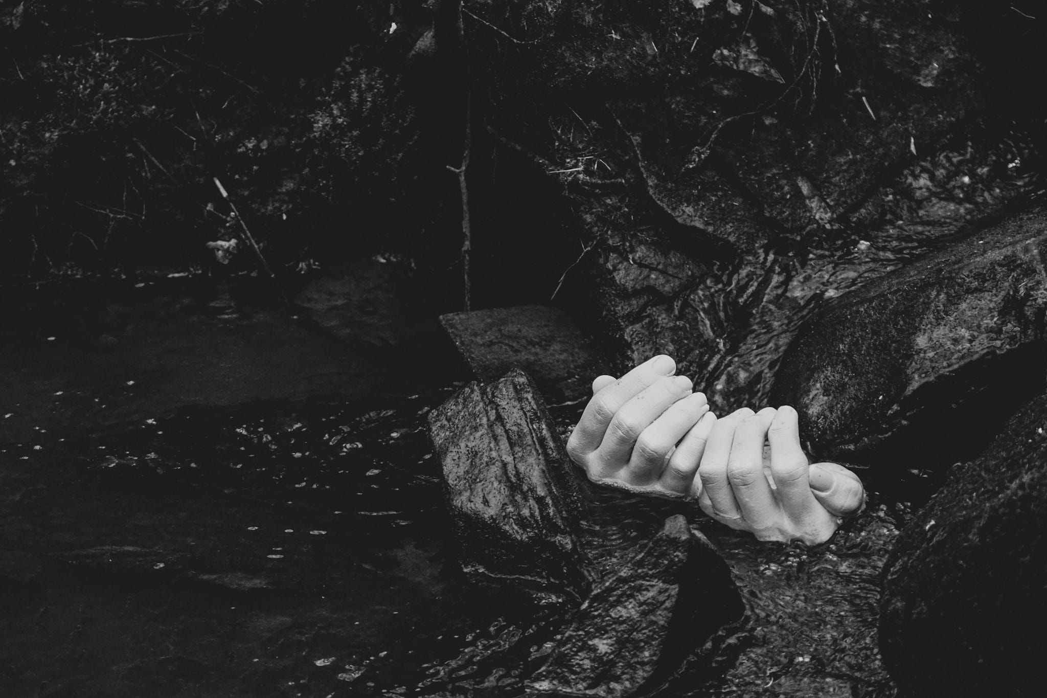
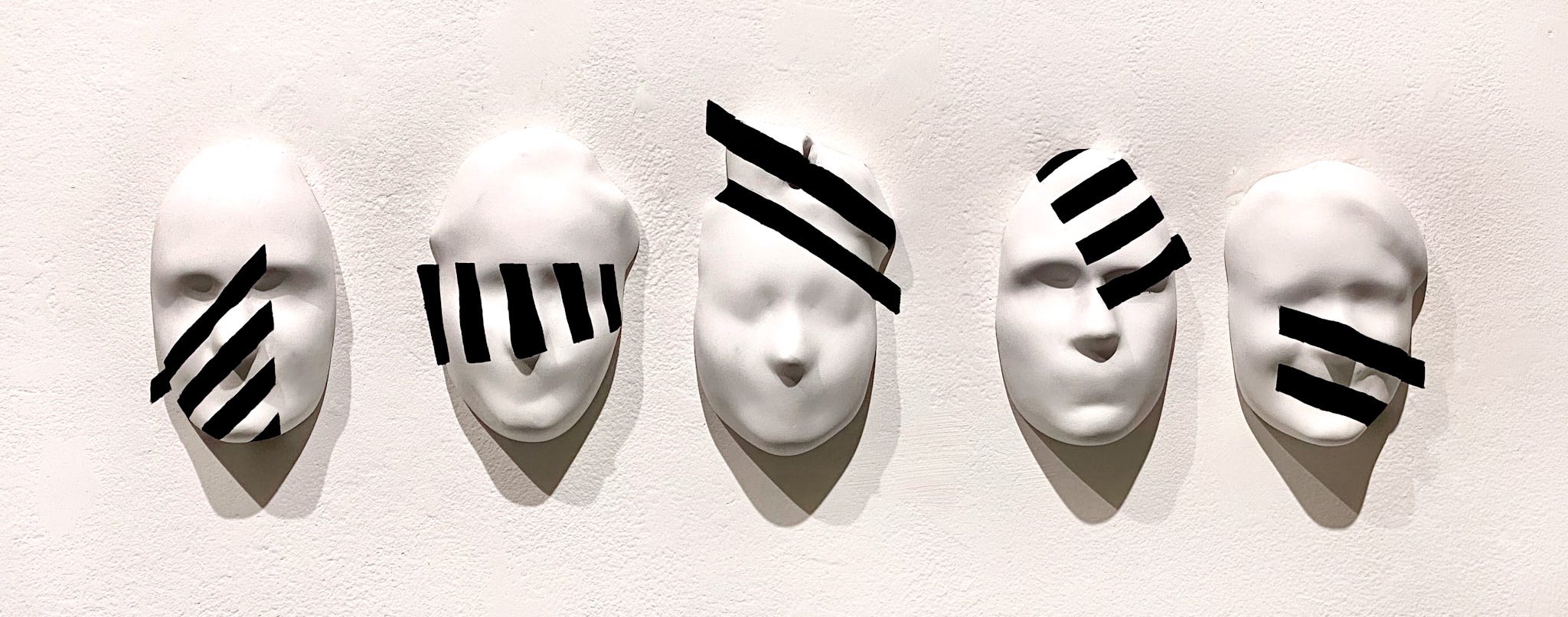
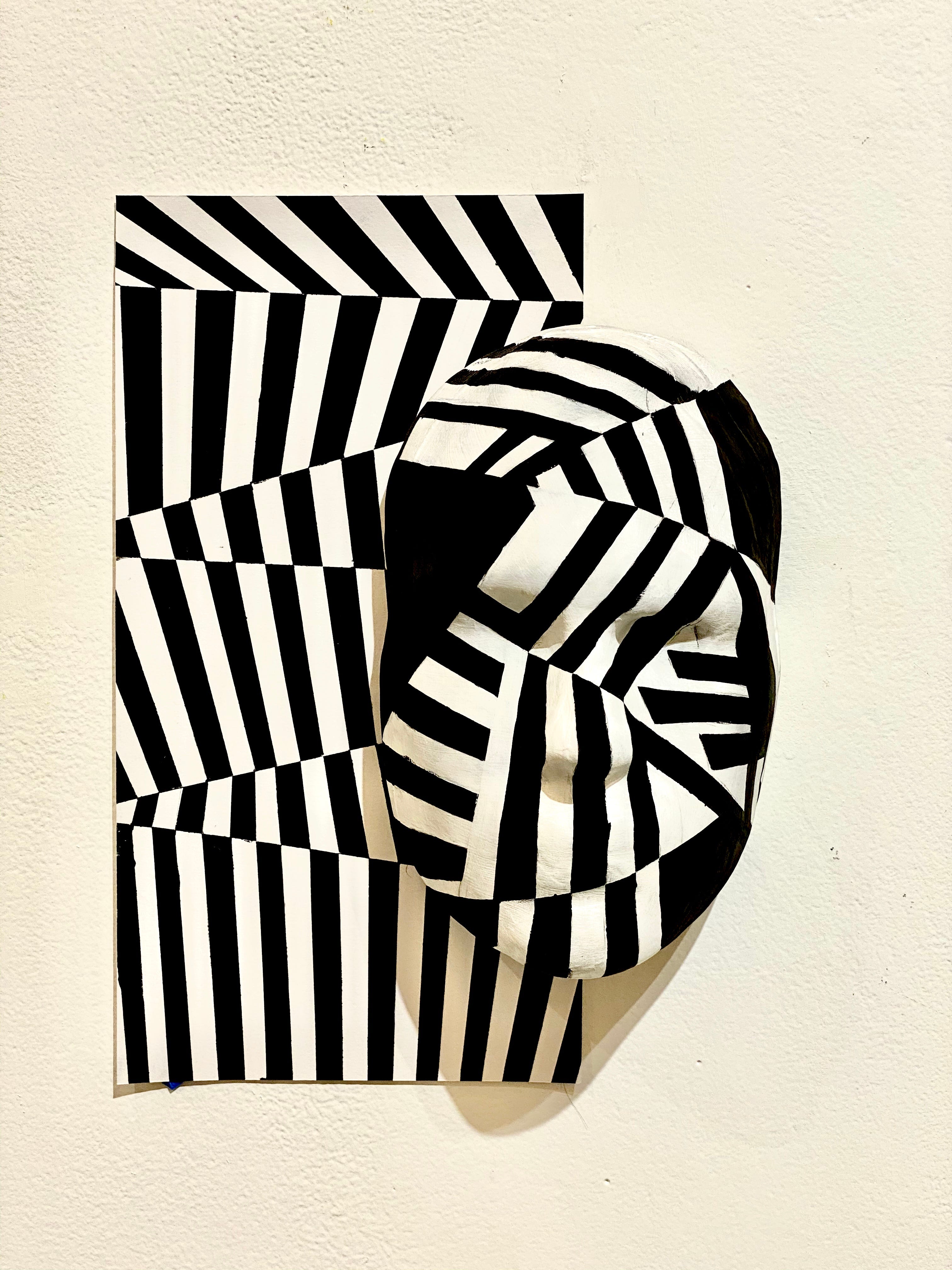
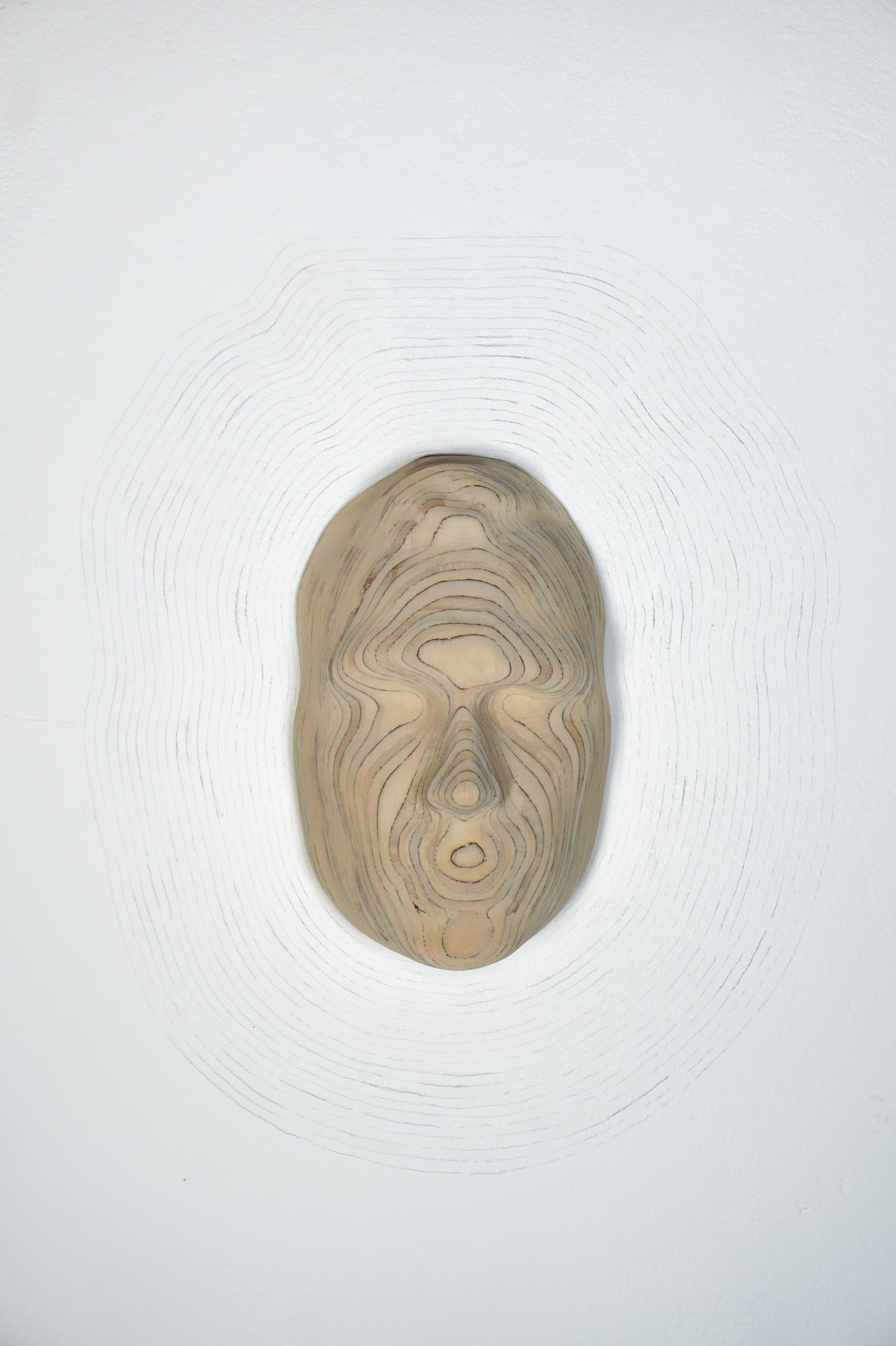
For more of Steven’s work:Steven Mentzer. HomeEdit descriptionwww.stevenmentzer.com
Final Studies are in partnership with The University of Akron and are made possible with support from Fifth Third Bank and the Robert O. and Annamae Orr Family Foundation.
Read MoreFinal Studies: Andrea Palagiano
Undergraduate Student, University of Akron
Painting and Drawing
Title of Exhibition: Self-Conscious
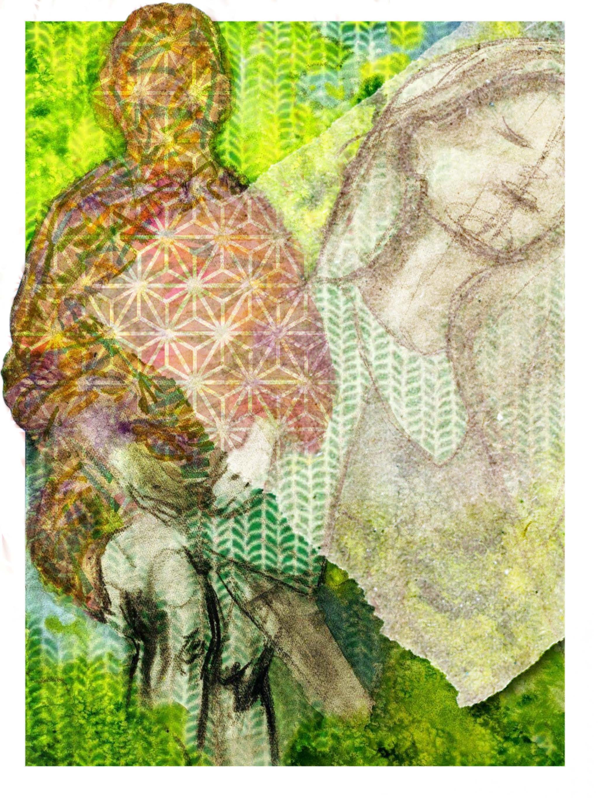
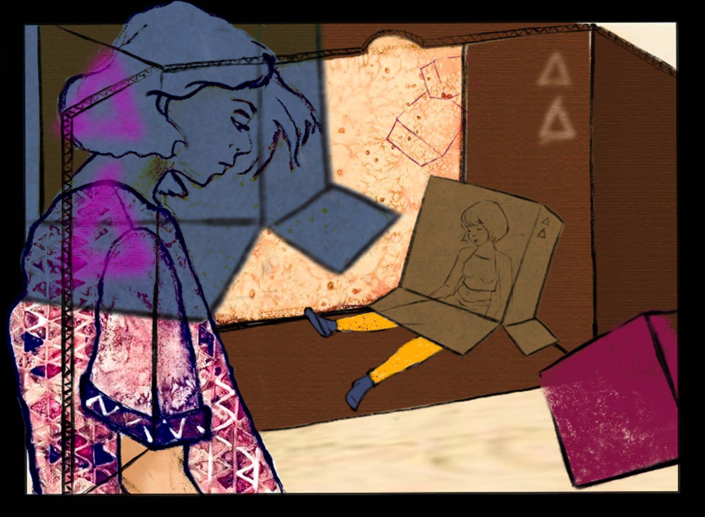
Self-Conscious is a reflection of the relation between introversion and projected self. The integration of figure and pattern along with application of layers is indicative of a person’s thought process in defining self within society. The narrative points to a sense of mystery and drama as the figures vary from passiveness and prominence. Bold, intense colors are married with neutral counterparts. Controlled patterns are juxtaposed with autonomous textures created by paint chemistry. Duality becomes a common thread as it mimics my own psychology navigating between the nature versus nurtured aspects of character.
This series came from experiencing intensified feelings of loss, desperation, frustration, and at times, apathy. With each process, the masks and layers serve as an allegory of personal journey and complexity of self within social consciousness.


For more of Andrea’s work:
andreapalagiano.com
Final Studies are in partnership with The University of Akron and are made possible with support from Fifth Third Bank and the Robert O. and Annamae Orr Family Foundation.
Read MoreFinal Studies: Alex Heard
Undergraduate Student, Cleveland Institute of Art
Sculpture + Expanded Media
Title of Exhibition: The Dog Ate My Heartache
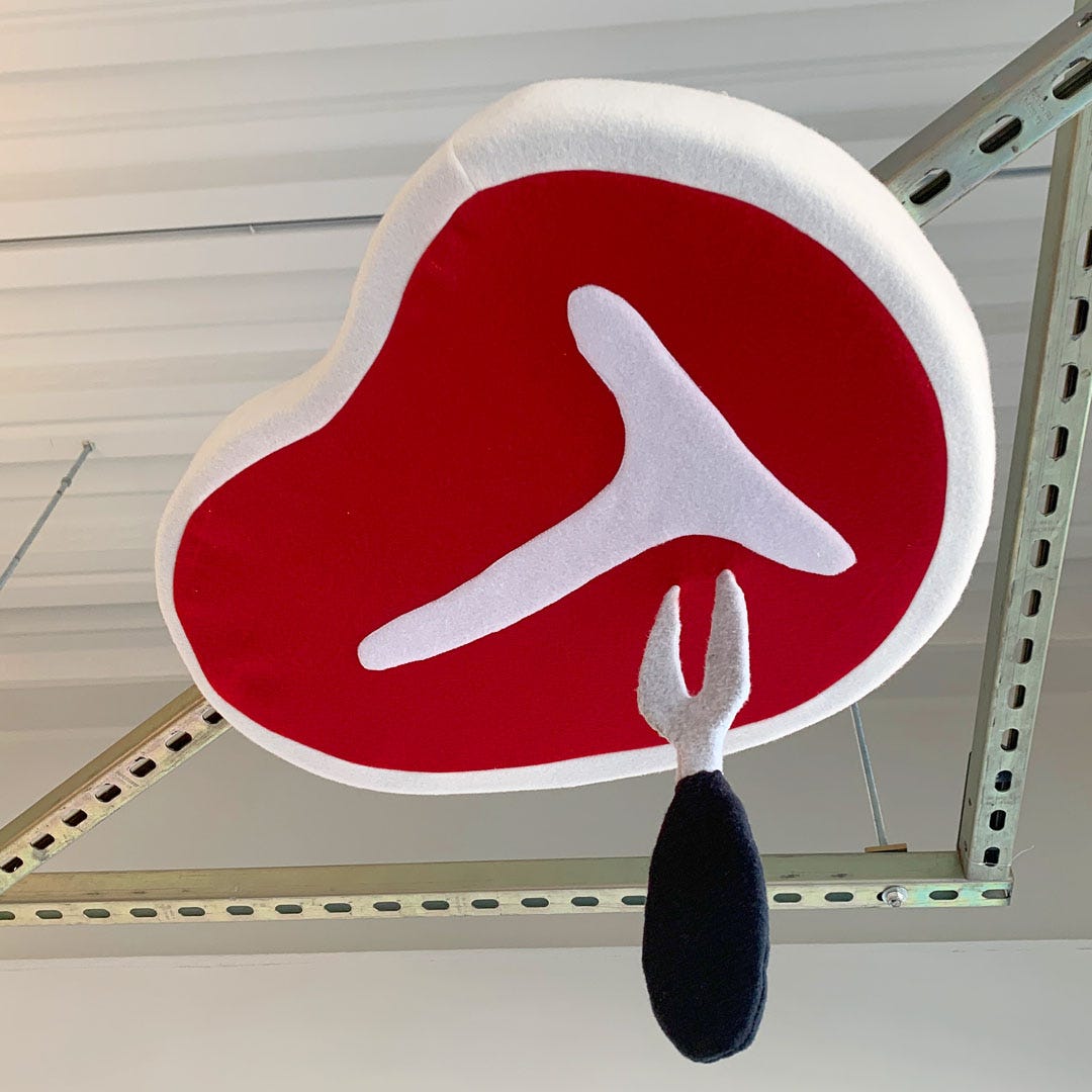
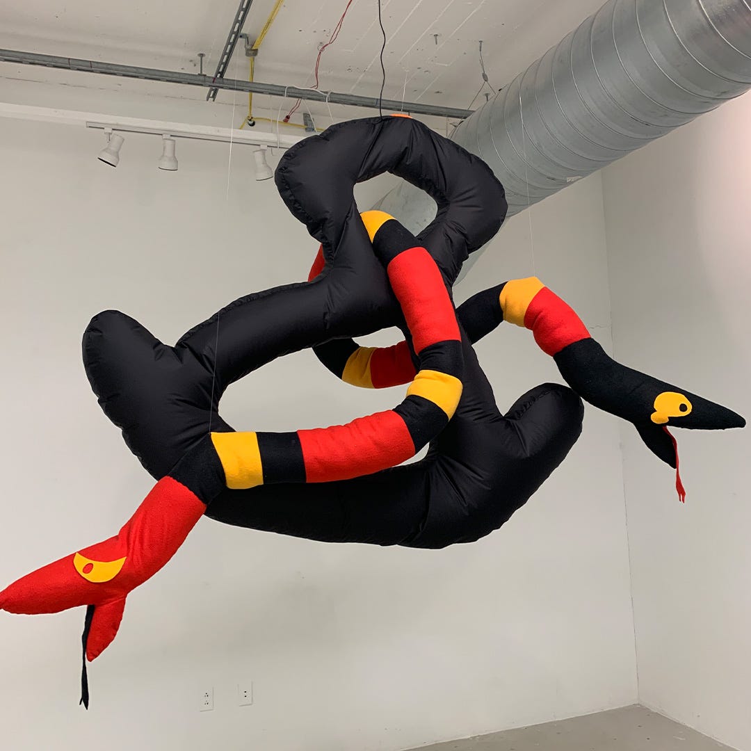
Imagine a world where everything is softer, more colorful, and a little bit weirder. Here the uncertainty of life is easier to handle. I am bringing that imagined world into reality through costume, performance, and installation. Our world is not always a cozy place, so why not make it softer.




For more of Alex’s work:
Instagram: @alecksheard
Final Studies are in partnership with The University of Akron and are made possible with support from Fifth Third Bank and the Robert O. and Annamae Orr Family Foundation.
Read MoreFinal Studies: Miguel Rivera-Vera
Undergraduate Student, Cleveland Institute of Art
Sculpture & Expanded Media
Title of Exhibition: Timid (/。\) Boy
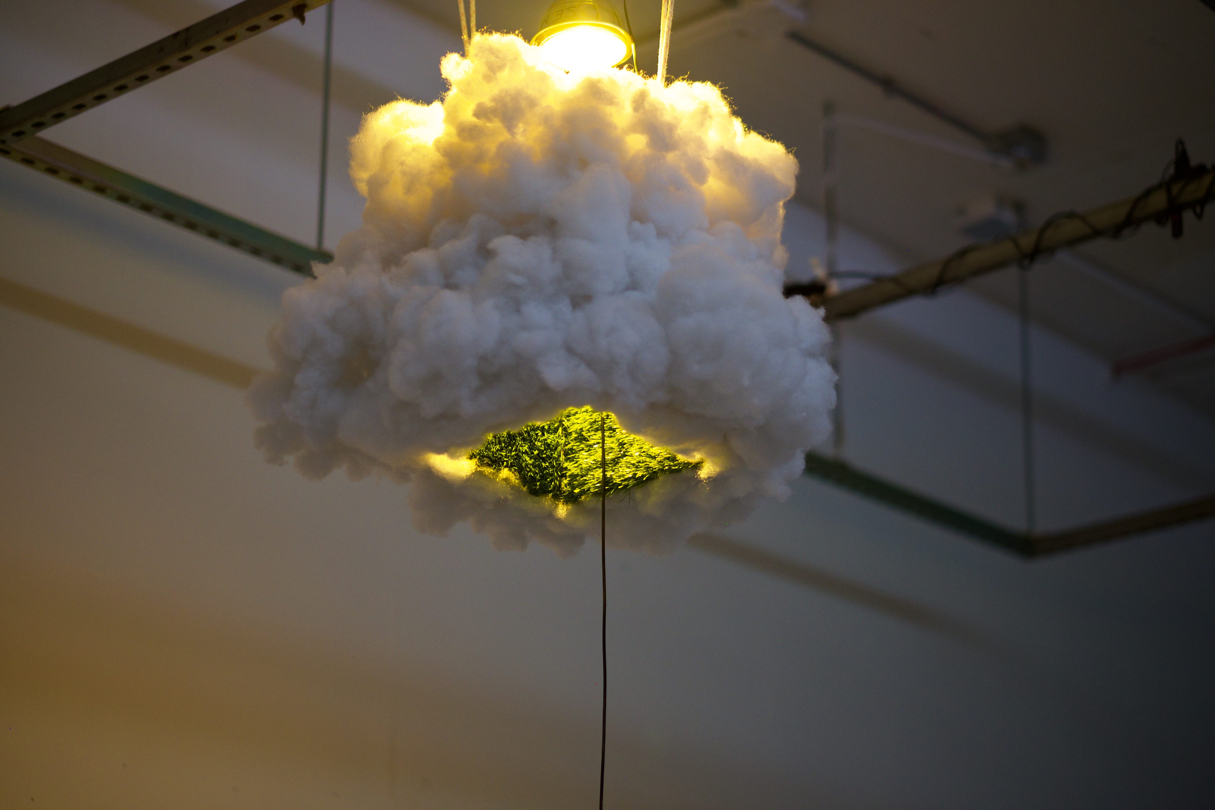
Often the world feels distant and leaves me with a sentimental longing to build a bridge to connect with a viewer. As a multidisciplinary artist, I create aestheticized objects, while utilizing video within my installations. The nature of my work is vulnerable, and creating a lived experience with my viewers.
For more of Miguel’s work:
Instagram: @miguels_r_us
Final Studies are in partnership with The University of Akron and are made possible with support from Fifth Third Bank and the Robert O. and Annamae Orr Family Foundation.
Read MoreResearch Mysteries from Quarantine: Part 2
By Jeff Katzin, Curatorial Fellow
When I let my mind drift towards broad questions about art, the issues are usually subjective: What makes a work of art beautiful? How can we balance awareness of artistic tradition with a true openness to new ideas? How can artists best communicate truths that are deeply personal? Questions like these are nuanced and exciting, but on occasion it’s a nice change of pace to delve into more objective issues; classic journalistic questions like who, what, when, and where. My last post about Ora Coltman’s Main Street, Cleveland answered a “where” question — Coltman’s scene took place in Cleveland’s Ohio City neighborhood, not on “Main Street,” but rather on Main Avenue. This time around, my research mystery starts with a similarly fundamental question about a work of art: Who?
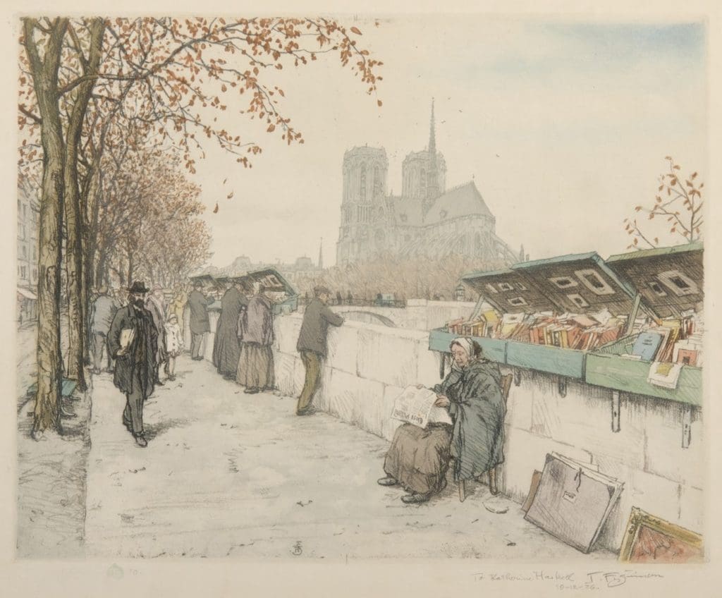
When I was first asked to look into this print titled Bookstalls Along Seine, I figured that there wouldn’t be too many basic questions left to answer. The pictured location is right in the title, and even if that reference to the Seine River, which runs through Paris, wasn’t convincing enough, the famous Cathedral of Notre-Dame de Paris is clearly visible in the background. As for the artist, he was kind enough to clearly sign and date the print in its lower right margin.
Even working from home and limited to online resources, I figured it would be easy enough to find out a thing or two about T. Frank Simon, his working methods, and perhaps his relationship to the city of Paris. However, when I ran a Google search for his name, I found just one page about artwork (and lots of pages about an immunologist in Kentucky). Even for an obscure artist, that’s a surprising lack of information. The one relevant result, from the Smithsonian American Art Museum, suggested that Simon might be Czechoslovakian, so I thought I’d try searching for “T. Frank Simon Czechoslovakian artist.”
That’s when things really started rolling. I’ll cut to the chase and share this truly amazing website:

It turns out that tfsimon.com pertains not to “T. Frank Simon,” but to a lauded Czech artist named Tavik František Šimon. The website, with a simple visual style but an incredible wealth of information, seems to be a labor of love composed by devoted admirers of his work. Though they certainly deserve it, the authors don’t always take credit, but I did find the names Catharine Bentinck and Eva Buzgova on some pages. Immediately, I became pretty sure that, despite the mixup about his name, Tavik František Šimon was the artist I was looking for. Compare this signature from tfsimon.com to the one from the Akron Art Museum’s print (pictured earlier):
That’s about as good as a match can be! For even further confirmation, the website includes a catalogue raisonné of Šimon’s career — in other words, a comprehensive listing of every known work that he ever made. It’s fantastic to have such an extensive and detailed resource available online. I looked in the graphics in miniature section and, sure enough, I found a matching image, #430. There it’s labeled as Quai de la Tournelle in Autumn, Paris and dated 1925.
This was already great progress, but I was curious about that 1925 date, since it appears that Šimon himself signed the Akron print a year later, “10–12–26.” Assuming for a moment that he actually made this print the previous year, what was Šimon doing in October of 1926, and why would he have added that date?
Once again, tfsimon.com stood ready with a tremendous level of detail. As it happens, the artist had a particularly eventful 1926, as he embarked upon a trip around the globe at the end of August. Before returning to Europe in February of the following year, Šimon saw Cuba, Japan, China, Singapore, Ceylon (now Sri Lanka), and more, and even made a number of stops in the United States. In fact, on October 12, 1926, the day that he signed the Akron print, he was in Cleveland, Ohio. Here’s his datebook from the time — like I said, the website provides a tremendous level of detail, if you dig far enough into it:
There are two entries for the 12th in particular. The second of these mentions something about “Bailey Art School,” and I was able to solve that one once I made my Google search sufficiently specific — it seems that Henry Turner Bailey would have been dean of the Cleveland School of Art (now the Cleveland Institute of Art) at the time, so Šimon very likely had a meeting with him. That private conversation probably has less to do with the Akron print than the first entry, which reads “Exhibition in the Union Trust Comp.” To figure that one out, I did some more digging on tfsimon.com and found this wonderful piece of archival material:
Coinciding with Šimon’s visit to Cleveland, his friend and supporter William Ganson Rose (a Cleveland-based advertising executive) organized an exhibition of the artist’s works, which was displayed in the downtown lobby of the Union Trust Company. As an aside, Šimon remained friends with Rose for the rest of his life. Not long after the artist passed away, his wife responded to a letter from Rose: “He remembered to his last days the nice journey in 1926 and his kind friends he met on the World trip. On Cleveland and on you Mr. Rose, he had the nicest recollections and spoke often with his family about you.” It’s my guess that Šimon gave the print that eventually made its way into the Akron Art Museum collection to someone at the exhibition that Rose organized, either as a gift or a paid purchase. This idea is supported by what can be found next to the signature and date in the print’s margin:
Now I had come to another “Who?” question — who is Katherine Haskell? I had a sense that I had heard that name before in connection with Ohio history, and so I did a bit of searching and quickly realized that there was a Katharine Haskell who is better known as Katharine Wright Haskell, the sister of the Wright brothers, Wilbur and Orville! In addition to serving as a crucial promoter and supporter of her brothers’ efforts in aviation, Katharine graduated from Oberlin College to the west of Cleveland and eventually split her time between Oberlin (where she was a member of the College’s board of trustees) and Dayton, Ohio (where she taught Latin at Steele High School).
It would be hard to find out exactly why she might have been in Cleveland on October 12, 1926, but the possibility that the museum’s print might be connected to a world-traveling artist and a historically-significant woman is quite enticing. There are a few pieces of contrary evidence, however. First, as you might have noticed above, Katharine Wright Haskell spelled her first name with an A (Katharine), while Šimon inscribed his print with an E (Katherine). But that could be an honest, minor mistake. Second, Katherine Wright did not marry and officially take the name Haskell until November 20, 1926 — too late, but only by a couple weeks! Maybe she asked Šimon to inscribe the print with her upcoming marriage in mind, and maybe he misspelled her first name. Regardless, it’s hardly certain that I have found the correct recipient of the print.
When various COVID-19-related restrictions are lifted, I look forward to finding a copy of Šimon’s diary entries from his world tour — the published collection was somewhat recently translated from Czech into English. If I’m lucky, I’ll be able to take this enticing connection from suspicion to confirmation. For now, I’ll settle for knowing that the Akron Art Museum’s copy of Bookstalls Along Seine is connected to an impressive voyage around the globe — not too shabby.
Coffee with the Collection is made possible with support from the Henry V. and Frances W. Christenson Foundation and the Samuel Reese Willis Foundation.
Read MoreFinal Studies: Jacob Butcher
Undergraduate Student, Oberlin College
Studio Art
Title of Exhibition: Night Movies
I’m interested in dreams, flowers, the occult, the aesthetics of VHS tapes, horror, and science-fiction movies; I appreciate art that gives an imagined thing like a gift to the viewer and I make comics in order to do that.
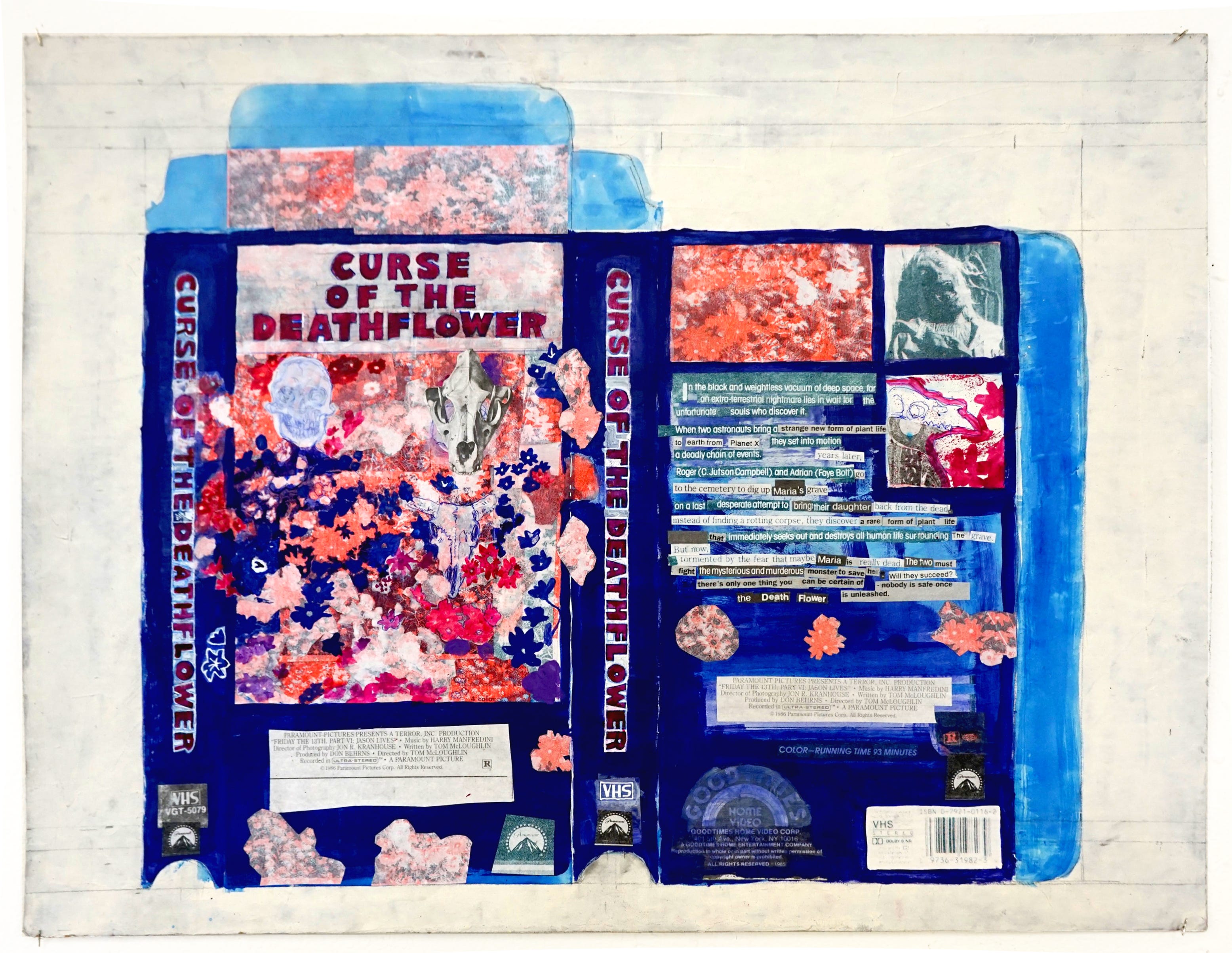
Artist Statement
I appreciate art that gives an imagined thing like a gift to the viewer and I make comics in order to do that. My work often involves narratives that are imaginative or fantastic. There is some unknown and beautiful aspect shared by irrational things like the occult, fiction, the dream, imagination, a playful drawing, stories, comic books, a science fiction movie. I think there is a common force present in all of these things, present in imagined ideas, that has a lot of love and power. I want to tap into that feeling.
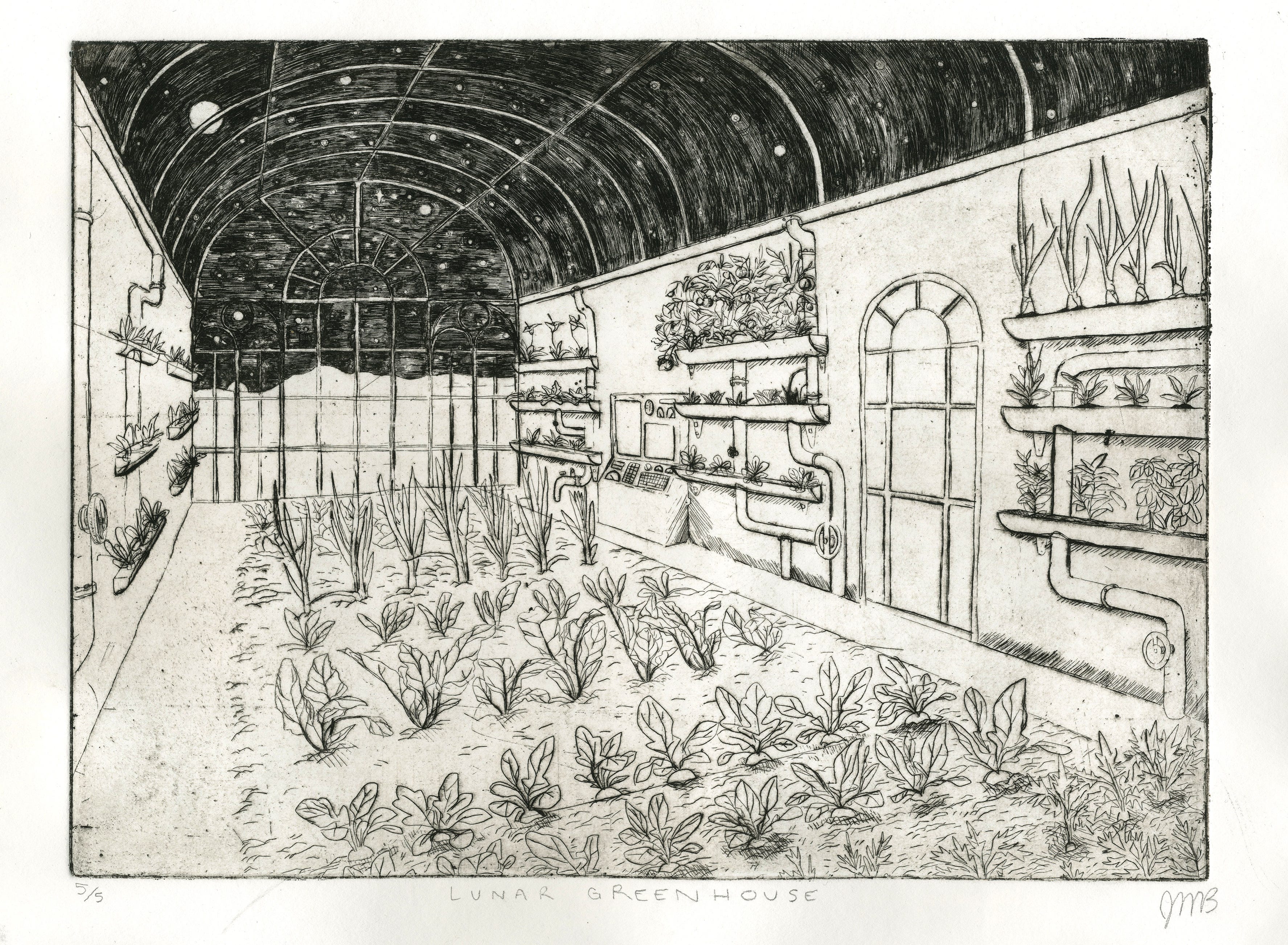
My work primarily involves processes of drawing, painting and printmaking. Currently I am focused on two major projects, a comic titled Night Movies, and a zine called The Garden of Orobas.
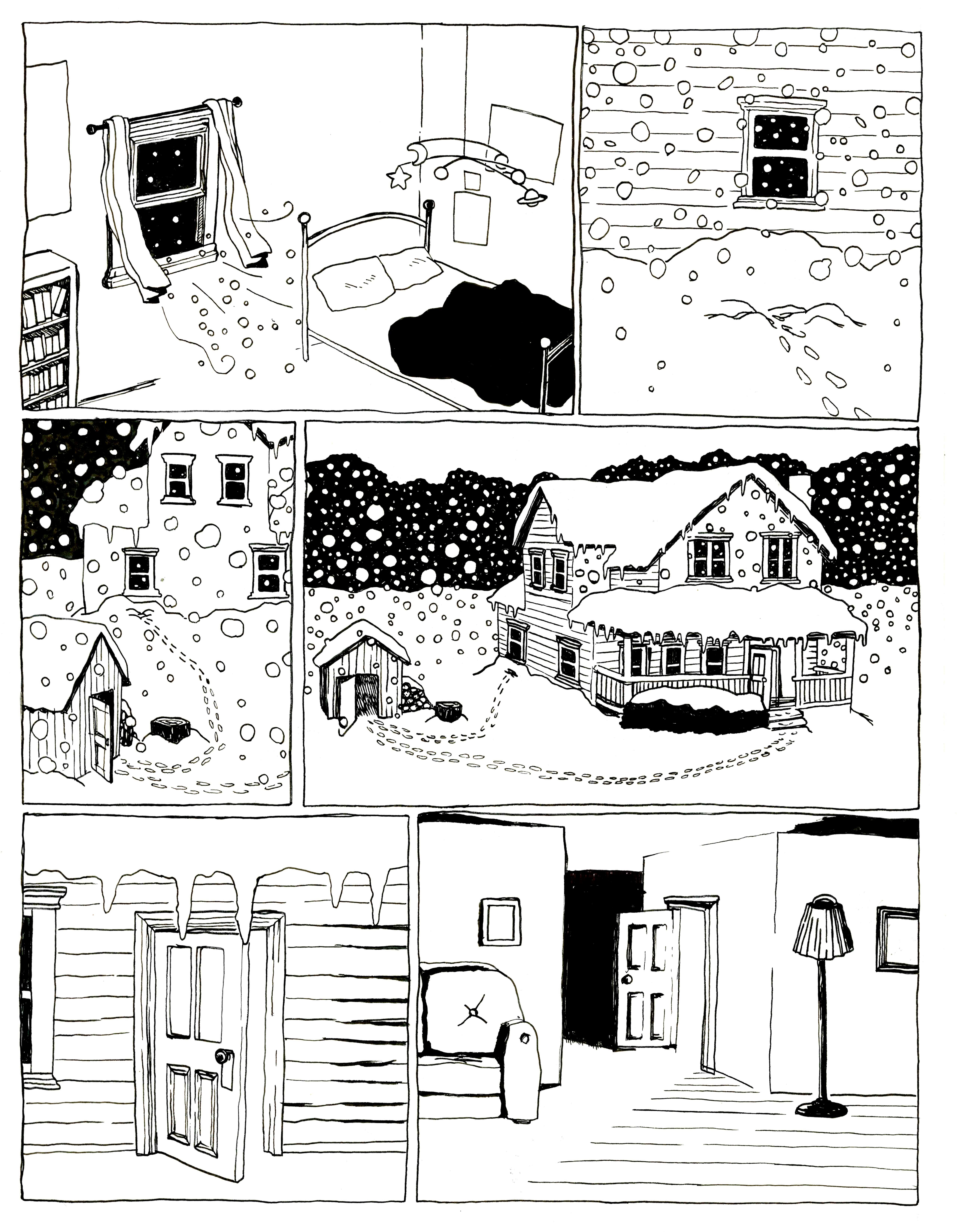

Night Movies
Night Movies draws from the aesthetics of 70s-80s horror and science fiction movies, and VHS tapes of that period. The story follows Maggie, a high school girl with a paranoid fear of being murdered. She compulsively watches horror movies, takes karate, and researches serial killers in the hopes of defending herself against the horrors she believes will eventually threaten her. Under the backdrop of a suburban environment pervaded by unknown sinister forces, she falls in love and her fears begin to unfold as the plot of a slasher movie.
Why Comics?
The process of creating comics is a long and slow one which I enjoy deeply. Comics requires a certain type of organization and habit-forming.
Comics allows me to tell stories in a similar way to movies, but without the prohibitively expensive and hyper-complicated process of production, and with the inclusion of the hand.
Keeping my hand present and visible in the work is important to me. Drawing allows me to keep my hand present while I translate and appropriate narrative devices and aesthetics from movies into comics.

Why Horror?
There are a number of reasons why I think Horror is an especially interesting and valuable genre, and I hope to include more of those angles as this story progresses.
The comic deals with vulnerability & its relationship to both love and violence. Horror movies, and particularly slasher movies are about the body. These films have been justifiably critiqued in the past for their treatment of sex, and I think that the Horror genre has much to offer us in exploring the relationship between bodily vulnerability, love, and violence.
Judith Butler writes, “I am referring to violence, vulnerability, and mourning, but there is a more general conception of the human with which I am trying to work here, one in which we are, from the start, given over to the other, one in which we are, from the start, even prior to individuation itself and, by virtue of bodily requirements, given over to some set of primary others: this conception means that we are vulnerable to those we are too young to know and to judge and, hence, vulnerable to violence; but also vulnerable to another range of touch, a range that includes the eradication of our being at the one end, and the physical support for our lives at the other.”
By evoking the structures of the Horror genre I hope to explore and illuminate some of the places along this continuum between death and love.
The Garden of Orobas
The Garden of Orobas is a surreal fantasy story told through paintings reproduced by a Risograph and compiled into a book. The story is centered on a house which was grown by the titular demon, Orobas, who cut out a piece of his brain and planted it in the ground. As Orobas’ mind decays in his old age the house and its garden have become warped and overgrown with vibrant flowers, regrets, memories and other strange creatures from the demon’s past.
Garden of Orobas will incorporate painting and collage which will be reproduced in book-form. The story will not follow a traditional narrative but will focus on detailing this imagined space and allowing the reader to explore and interact with it, possibly through games like Dungeons & Dragons.
This project also deals with horror & its relationship to beauty. On a certain level all of these paintings include a central juxtaposition of demons and flowers. The demons referenced in the story are all based on illustrations from a 19th century Dictionary of Witchcraft called the Dictionairre Infernal.
Why D&D?
I’ve been playing roleplaying games for years and developing my own games for just as long. The ways in which games like D&D allow players to participate organically in a story, and the emergent narrative techniques which can be employed in those games are truly unique to the medium. No other kind of story allows its viewers to fully determine the plot through the actions of its characters. There is an anarchic or participatory-democratic nature to these games.

Why Riso?
The Risograph is an obsolete form of printing technology originally marketed towards schools, churches, and offices in the 80s-90s. It is well suited to large print runs, its materials are cheap and more environmentally sound than other printers, and it creates a specific visual effect somewhere between the digital grit of a xeroxed punk zine and the layered color of a silk screen.
I’m attracted to the Risograph as a means by which to mass-produce handmade art objects. I’m interested in the multiple and the ways mass-produced objects generate an Aura, not exactly like that of original objects but an aura nonetheless with its own history and character.
For more of Jacob’s work:
Instagram: @jacobbusiness
Final Studies are in partnership with The University of Akron and are made possible with support from Fifth Third Bank and the Robert O. and Annamae Orr Family Foundation.
Read MoreFamily Day: Art-BQ
Ah, peak summer — barbecues, picnics, outdoor fun. Who says snacks need to be just for eating? Gather your leftovers, your favorites, whatever you got — and let’s have an Art-BQ! We even have a kit of supplies to help you get started.
Project 1 — Art with Personality
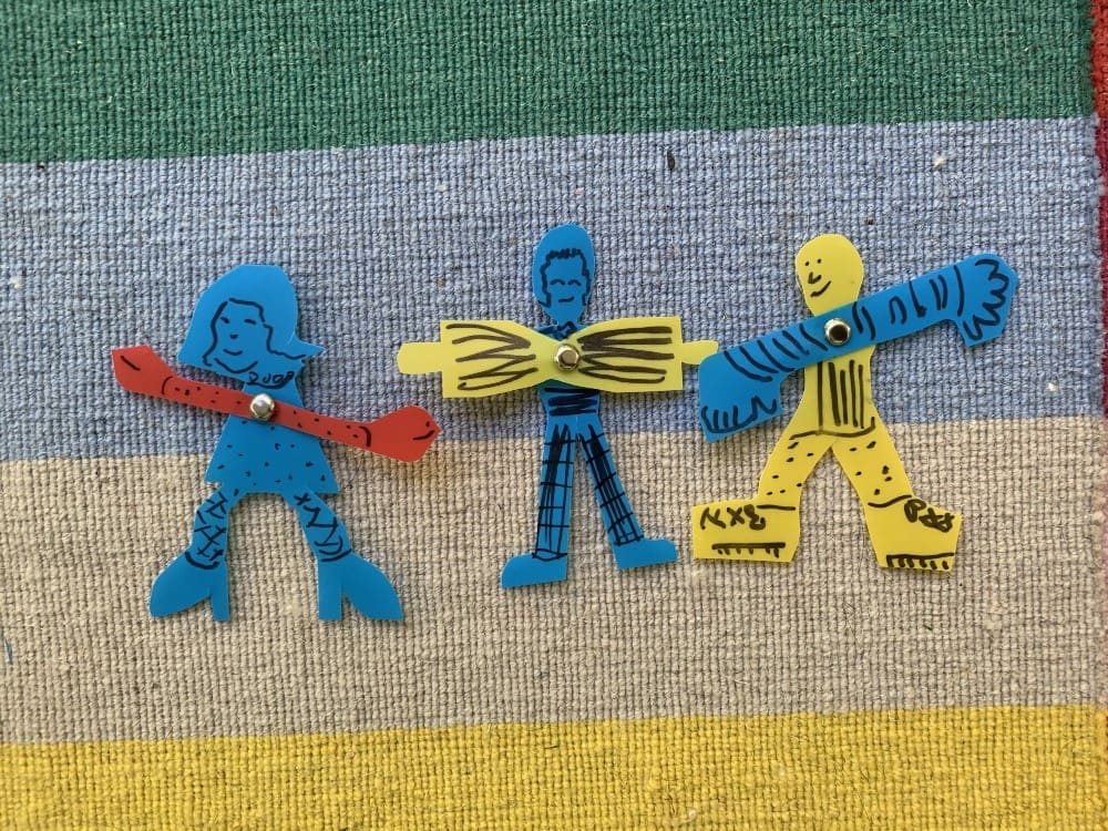
Try your hand at making art with a personality. Popsicle sticks, fabric, and markers are all you need for some fun dolls. Bending pipe cleaners is a great way to explore gesture. Construction paper and pompoms can make funny faces or you can use construction paper alone. These are just a few ways to make people with your kit.
What do you need? Compile a stack of supplies you’d like to use to make people, like popsicle sticks, fabric, and markers. Try to choose 2–4 items for your first experiment. Then choose a different 2–4 for your second experiment.
Try this? You can challenge yourself to make the funniest faces or the most active people. Or you can make faces of aliens and monsters. What is the silliest person you can make? The scariest monster?
Project 2 — Spice up your wardrobe
Summer is the time to spice up your wardrobe. Pipe cleaners and beads made from straws can look fetching. Pompoms can also be added to pipe cleaners to make bracelets or necklaces. Hats and crowns can come together in a snap. What wearables will you create?
What do you need? When making wearables pick something to serve as the base. Pipecleaners or construction paper can both be great. Other items, like pom poms or sequins, can make great decoration.
Try this? The bag the kit comes in can make a great base for a hat as well. What is the tallest hat you can make? The funniest? The fanciest? What other wearables can you make?
Projects 3 — Pinwheels and Windsocks
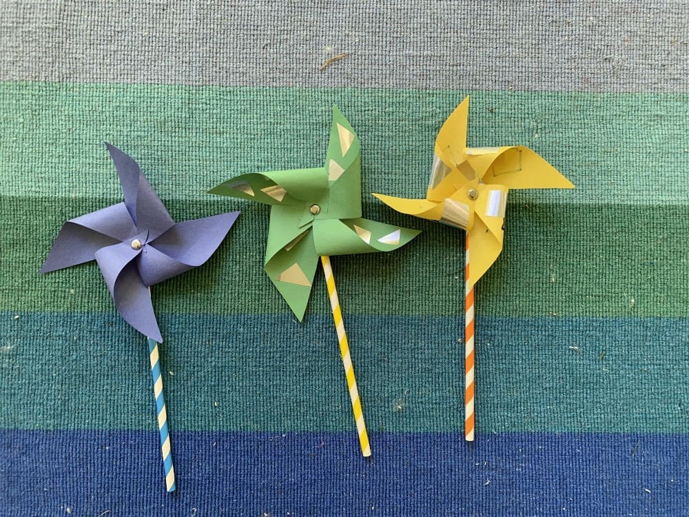
Sculptures are fun to make from any combination of materials. Being outside is an important part of summer; a pinwheel can make those outdoor days brighter. The envelope with some creativity can make a windsock. Add things you have at home, like corks or clothespins. Brads can turn something boring into something moveable.
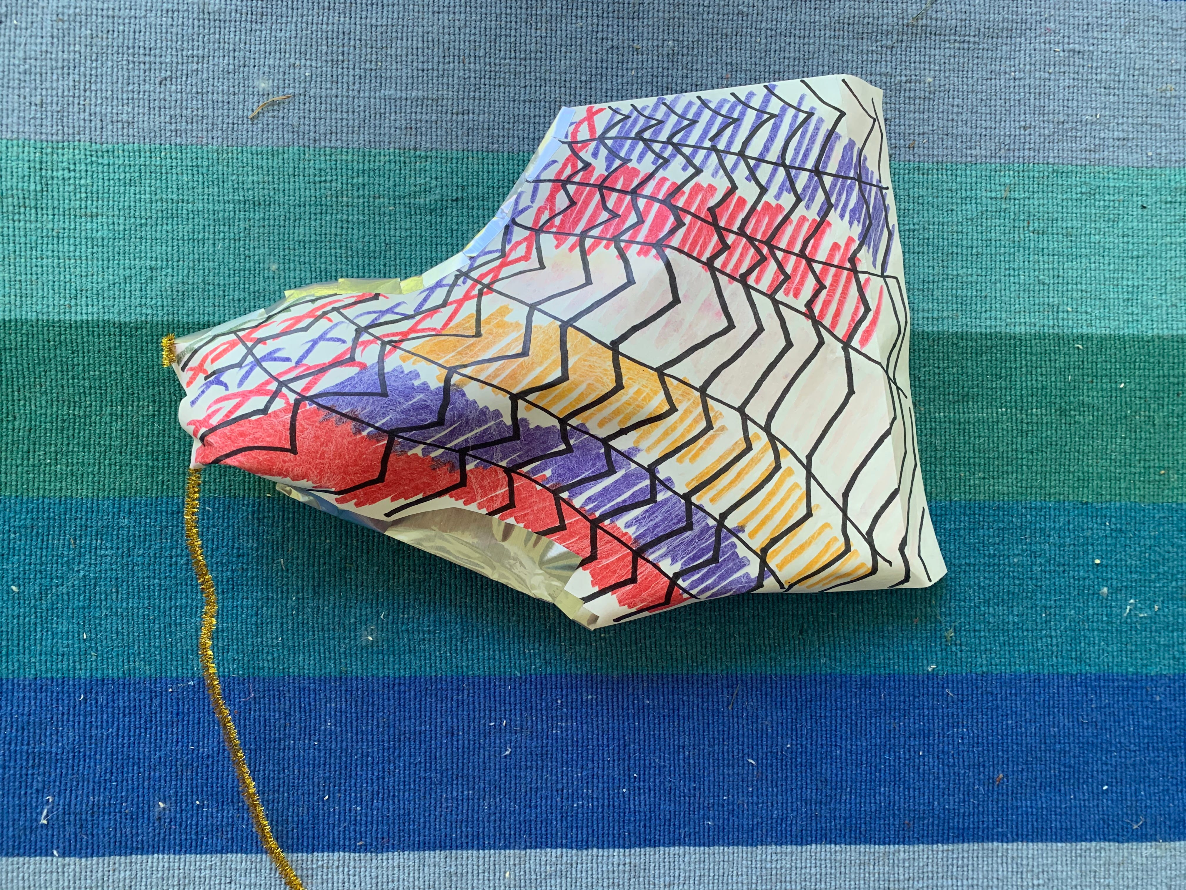
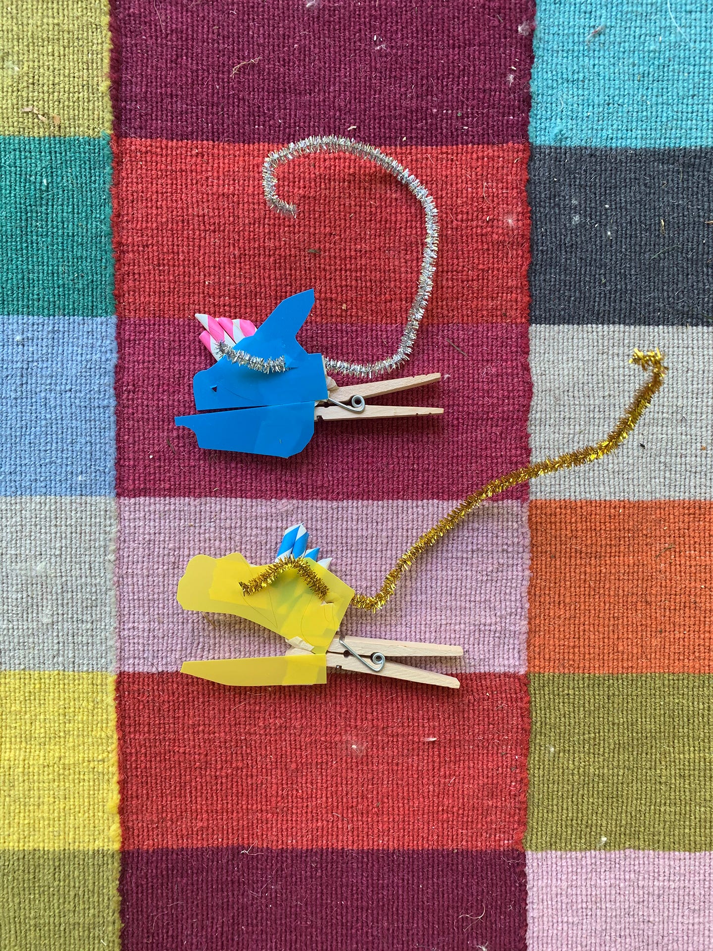
What do you need? The sky’s the limit with sculptures at home. The key is to choose the right tool to keep the parts together. A paper sculpture need only be affixed with staples or tape. Heavier items like popsicle sticks and pom poms work best with glue. Experiment with the materials before starting your sculpture.
Try this? Many artists make sculptures that move like mobiles and stabiles. You can also try making a sculpture that makes sounds. What other senses can you enliven with your sculpture?
Project 4 — Alternative tools for painting
You may think paintbrushes are only one way to paint. Explore what other tools from your kit can be used to apply paint. The surface you paint on can be transformed with foil or tissue paper. Or you can make a translucent masterpiece by painting on the clear vinyl.
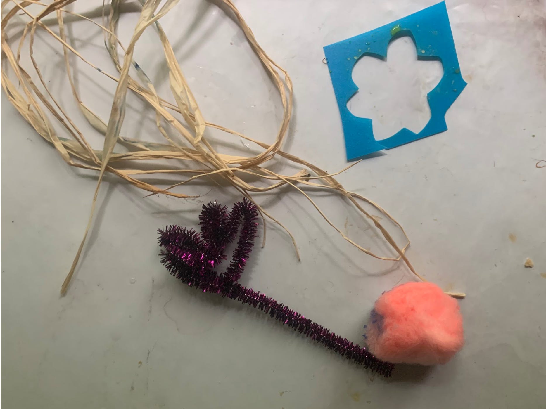

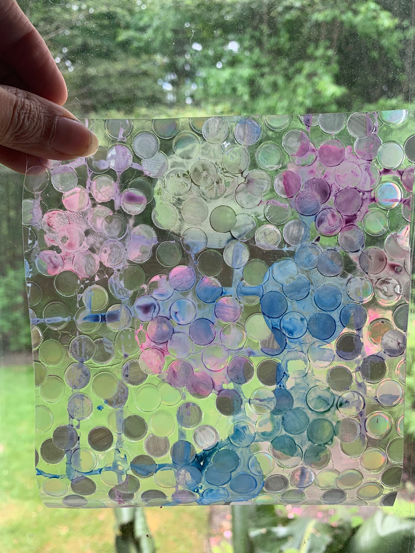
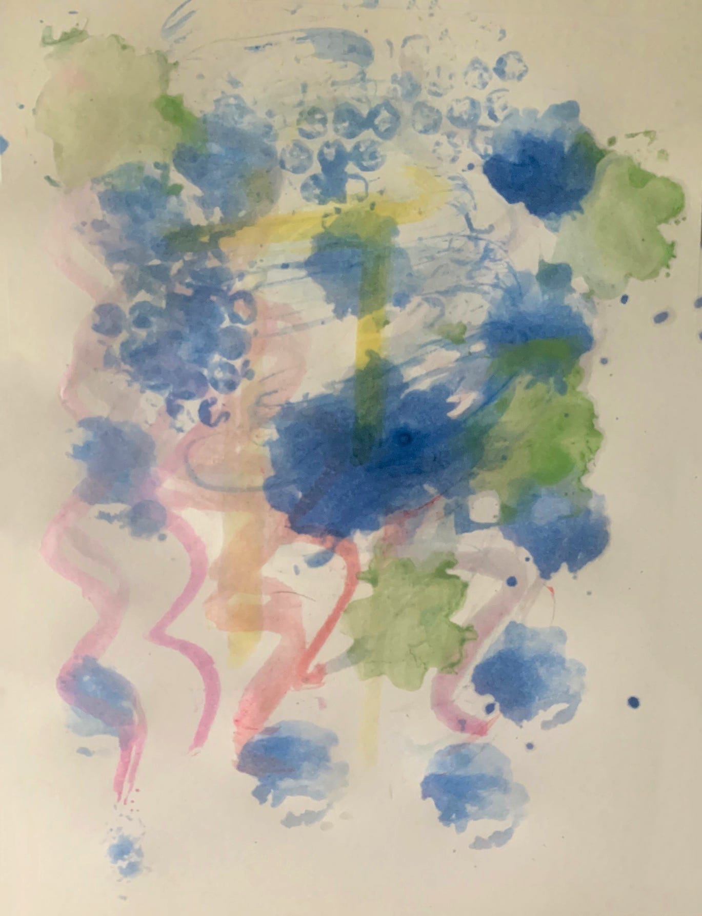
What do you need? Compile as many non-paintbrush tools as you can. Add paper, watercolors, and water. You can also compile as many non-paper surfaces to paint on. Add brushes, watercolors, and water.
Try this? Painting without a brush can help you explore abstract painting. You can get a better feel for pattern and texture.
Family Days are made possible by PNC with additional support from The Kathy Moses Salem Philanthropic Fund of the Akron Community Foundation, The R.C. Musson and Katharine M. Musson Charitable Foundation, and the Robert O. and Annamae Orr Family Foundation.
Read MoreFinal Studies: Michelle Pokorny
Undergraduate Student, Kent State University
Glass
Title of Exhibition: Syncretic Thoughts
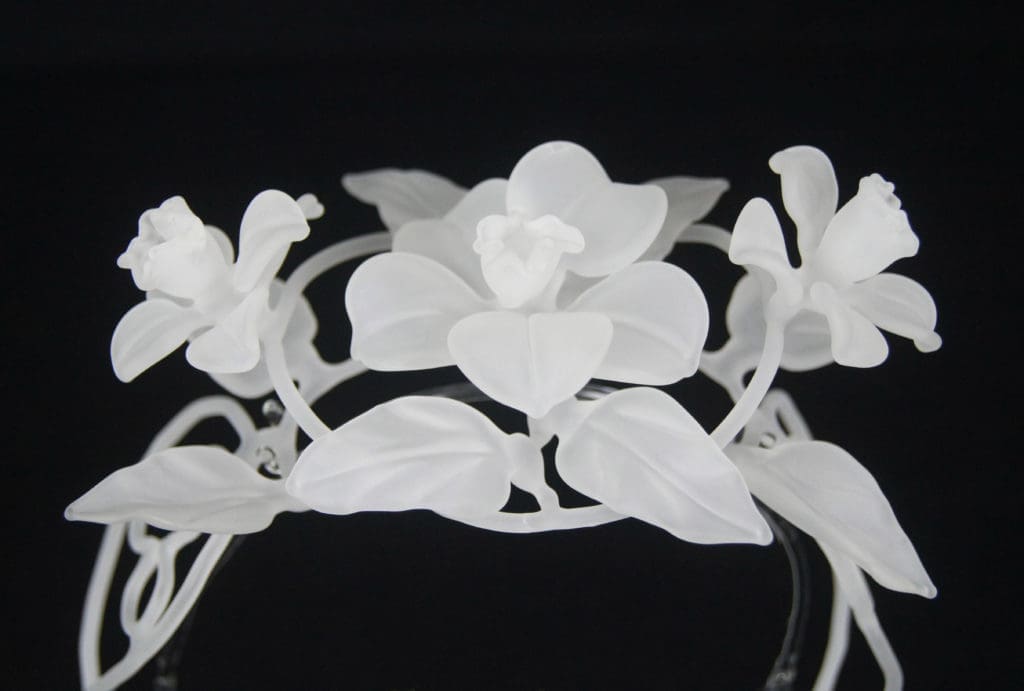
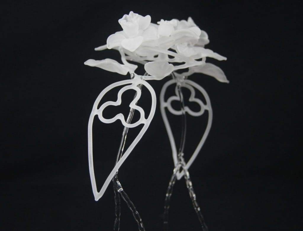
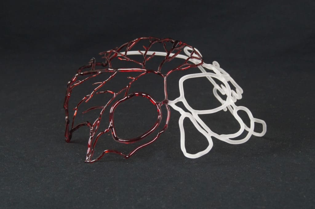
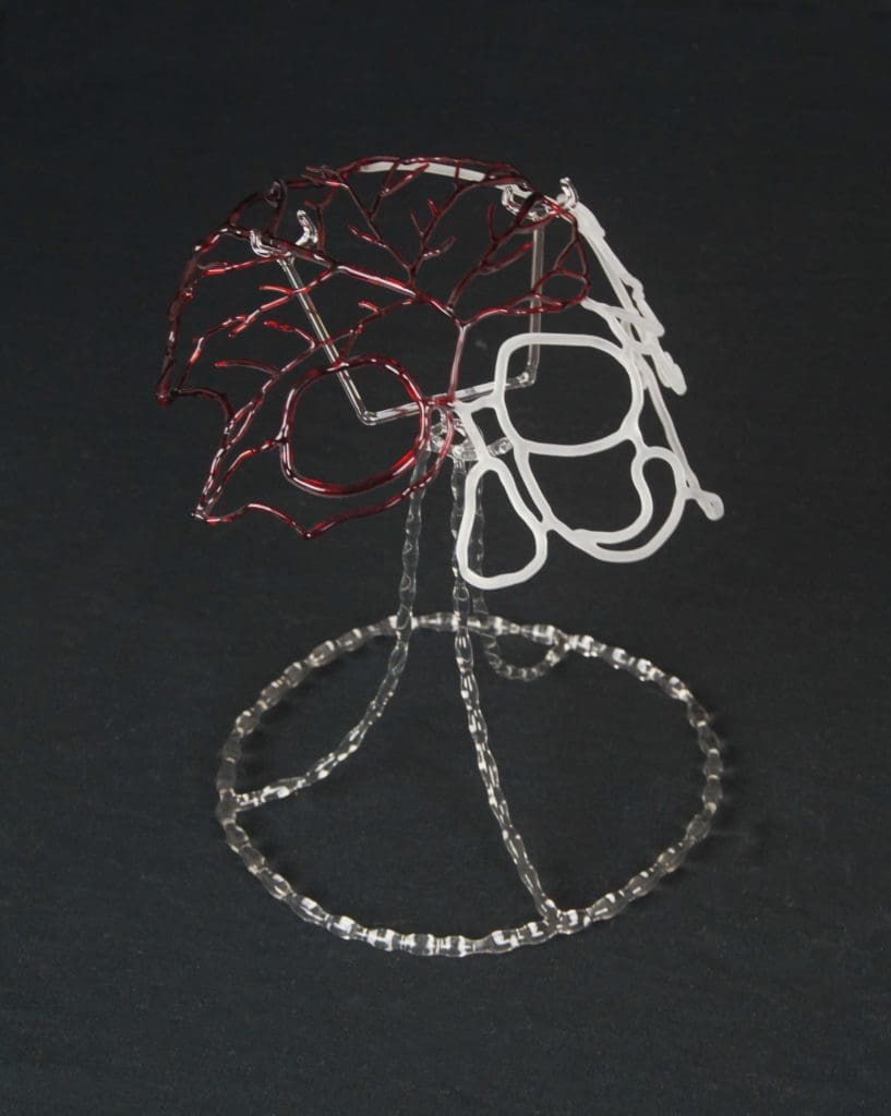
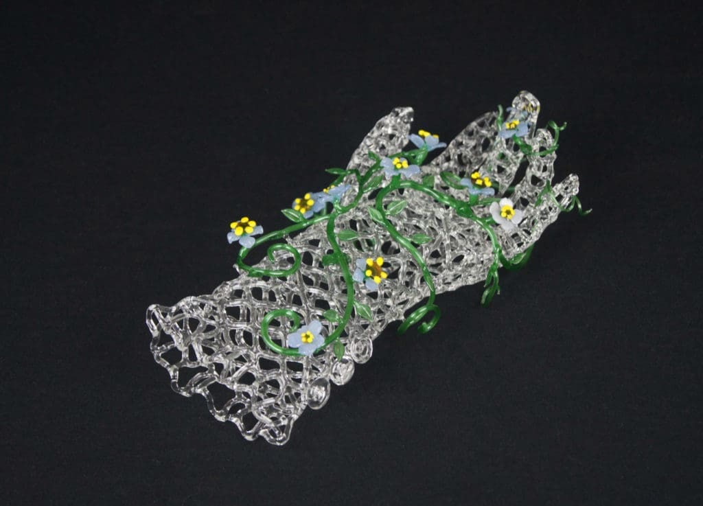
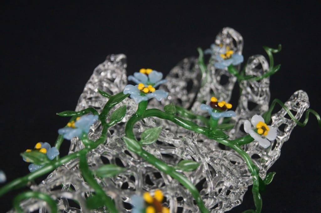
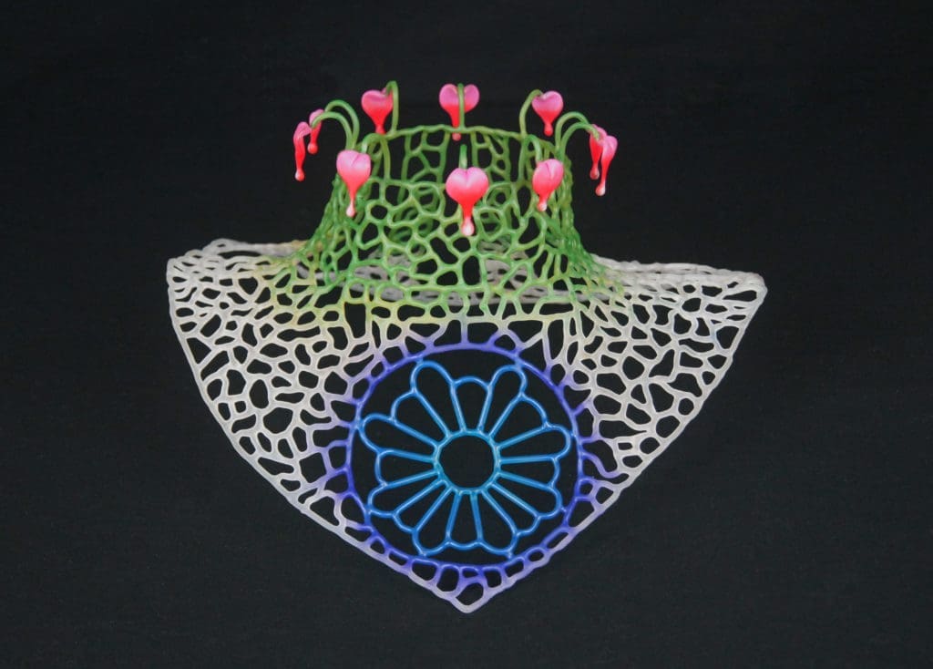
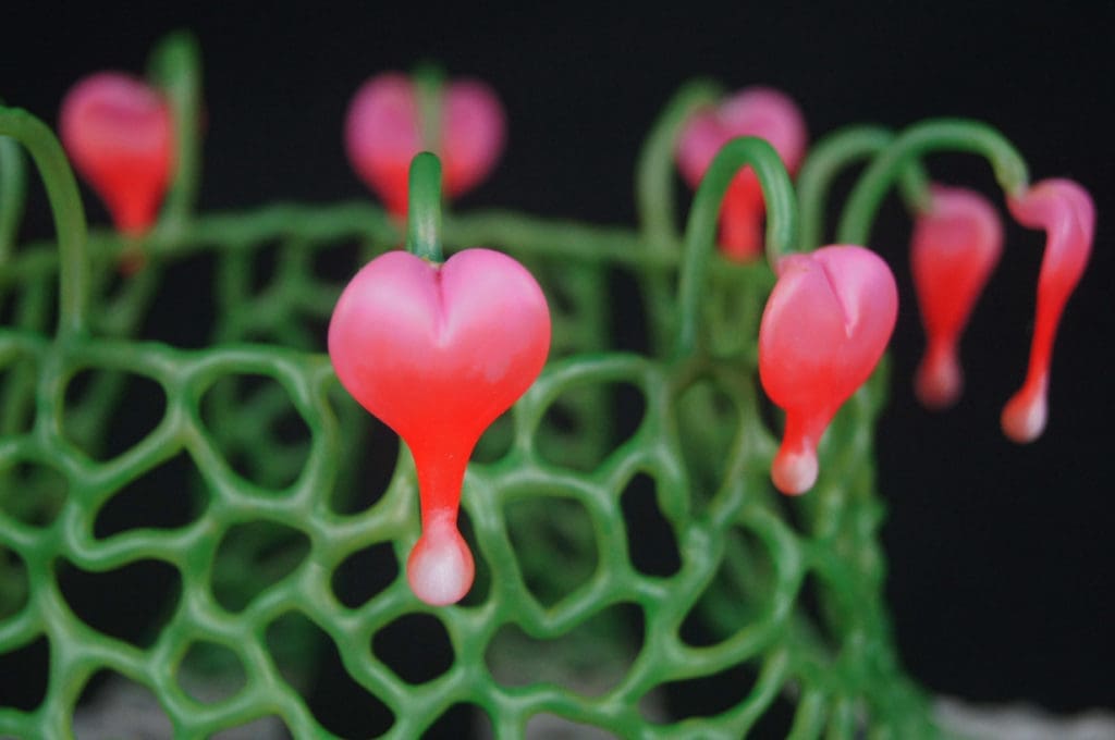
I find nature and humans connect with growth and communication, by combining wearables and plants so I can create relationships between the two. When adding plants to wearables the connection can be redefined into an idea where you connect to the significance of the pieces.
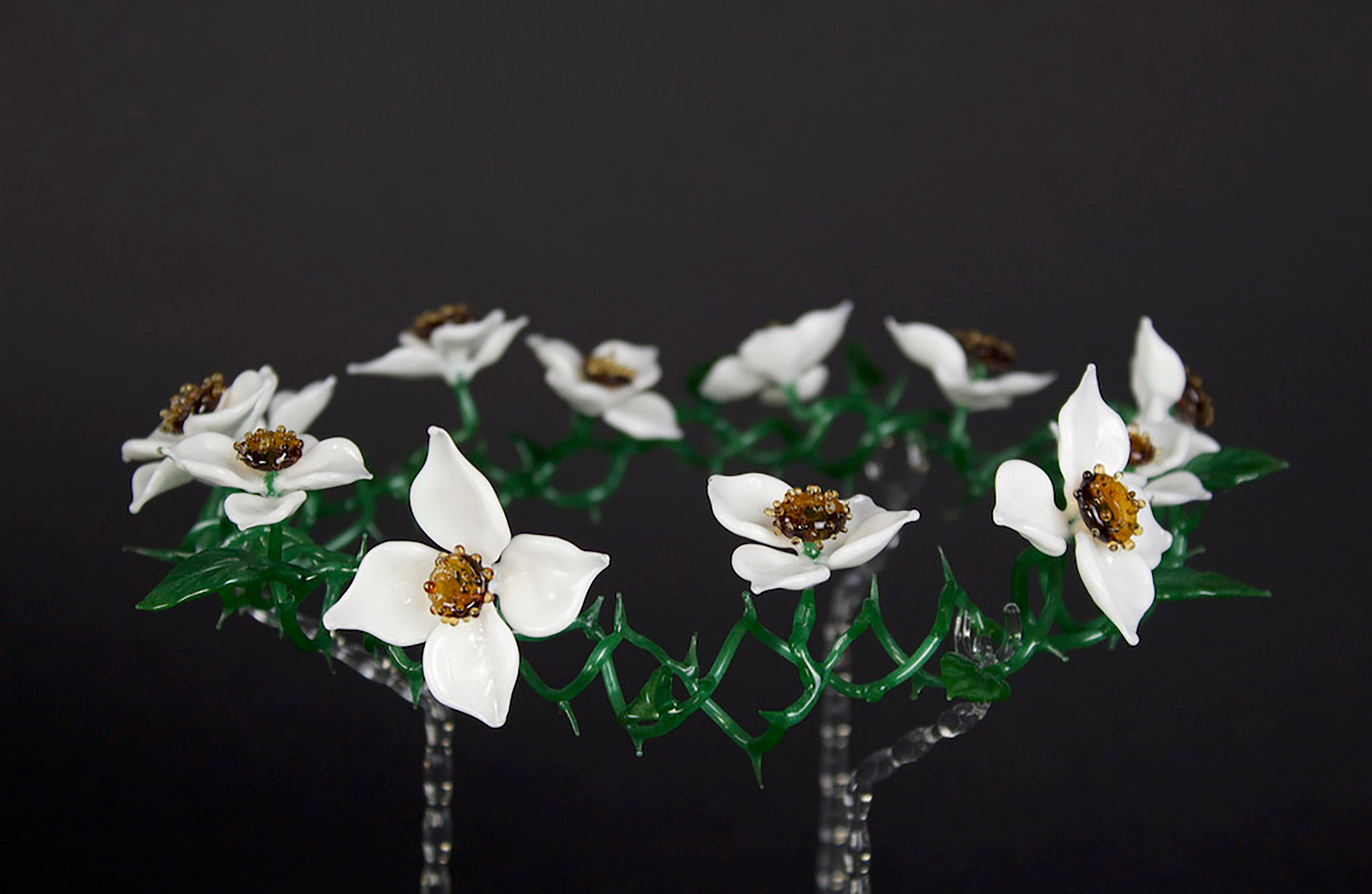
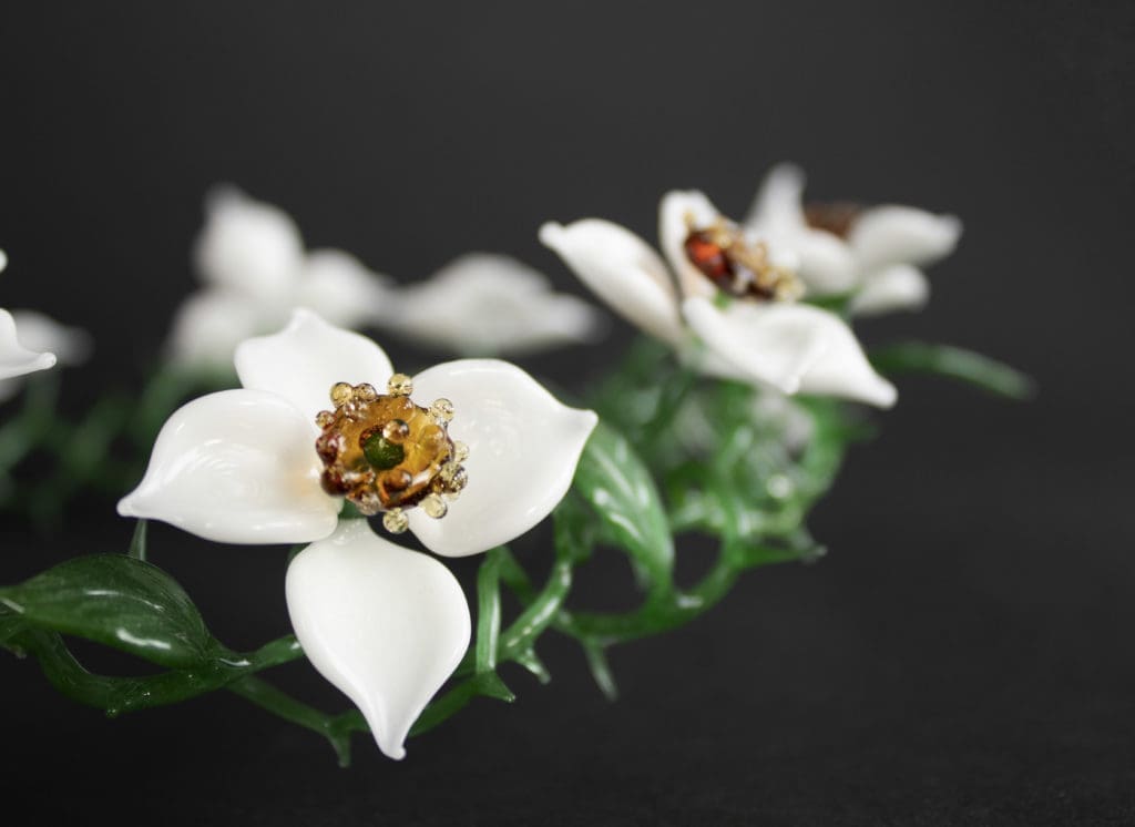
For more of Michelle’s work:
Instagram: @mpokorny_glass
Facebook: @mcpokornyHome | MichellepokornyEdit descriptionpokornyglass.wixsite.com
Final Studies are in partnership with The University of Akron and are made possible with support from Fifth Third Bank and the Robert O. and Annamae Orr Family Foundation.
Read MoreFinal Studies: Nikodem Adamski
Undergraduate Student, University of Akron
Painting and Drawing
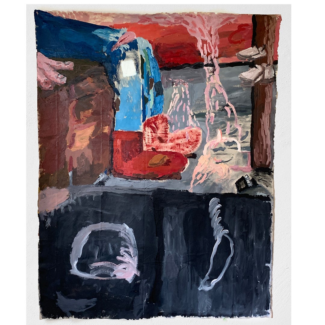
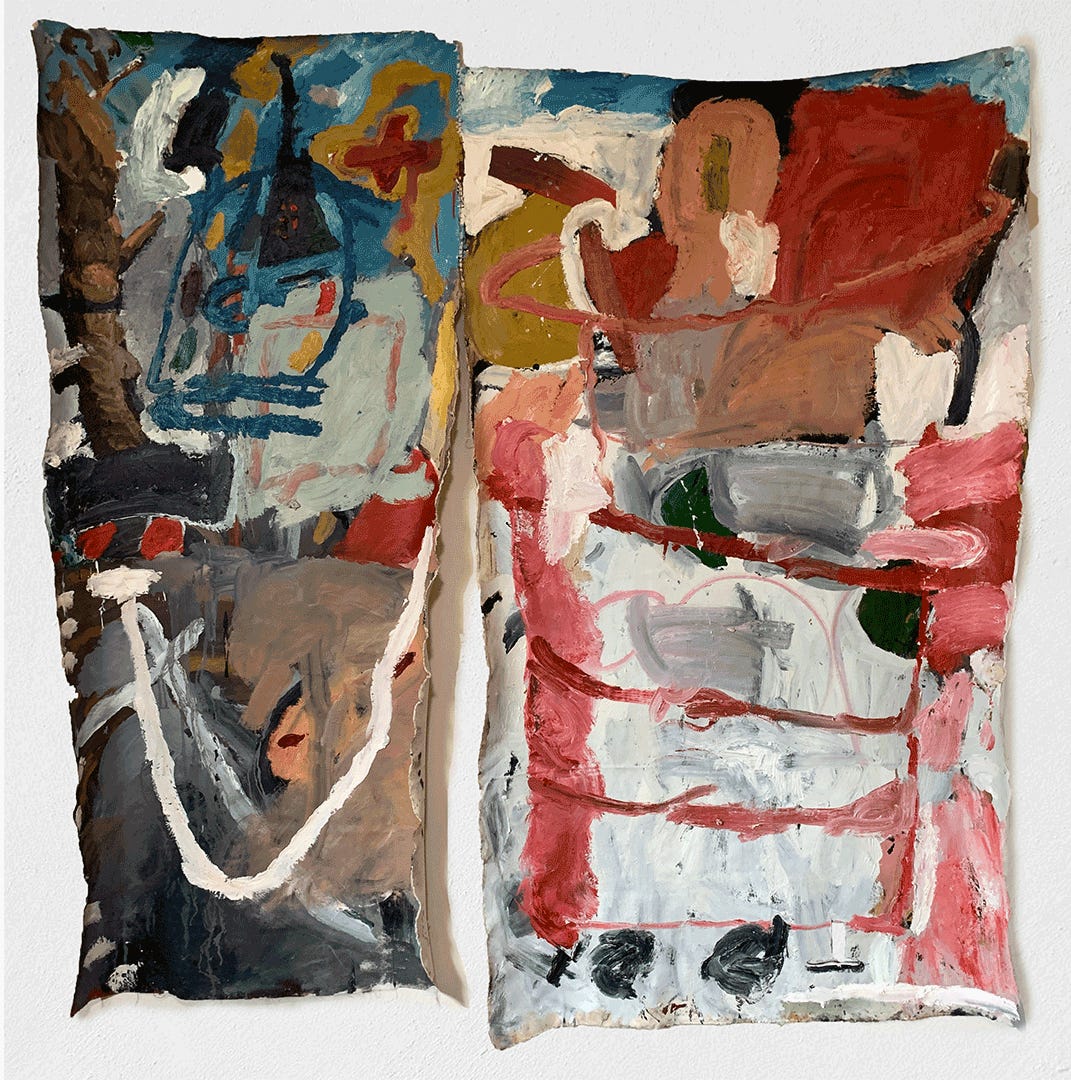
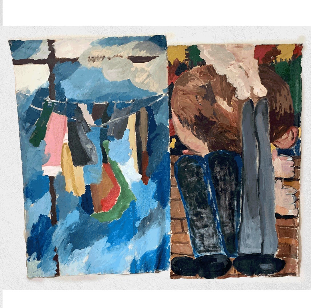
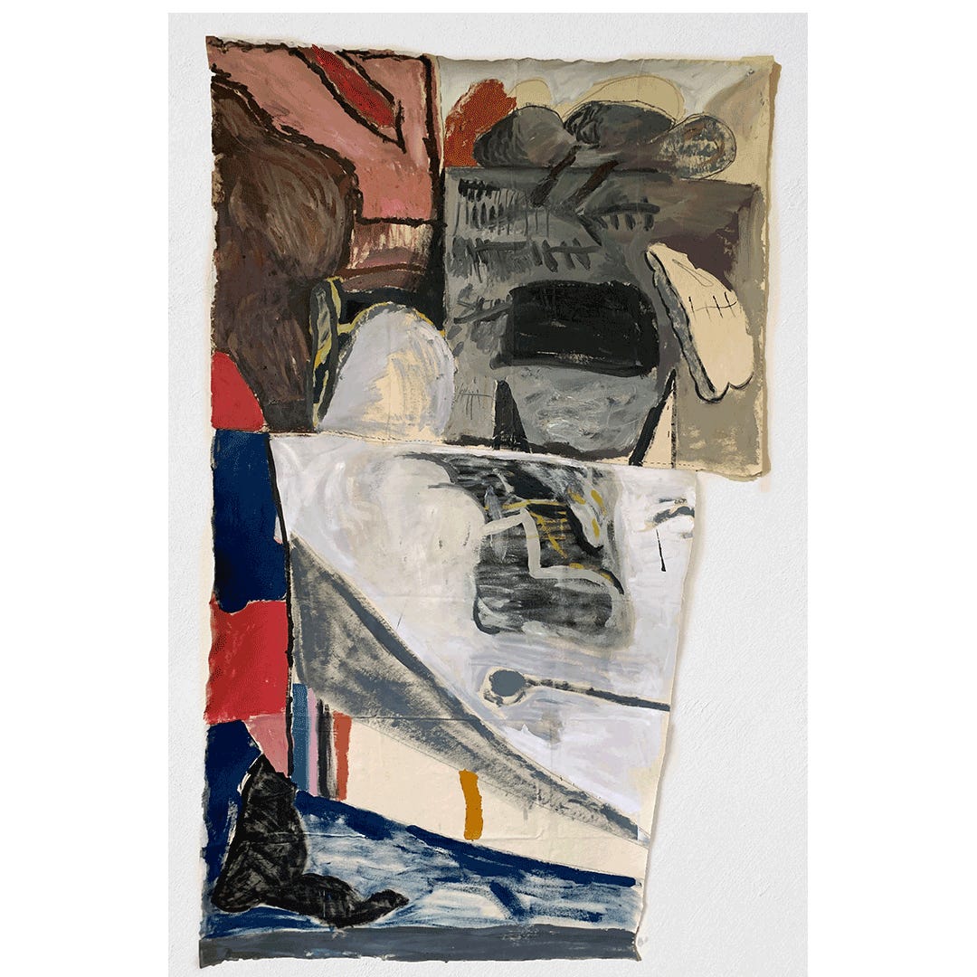
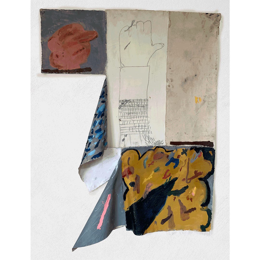
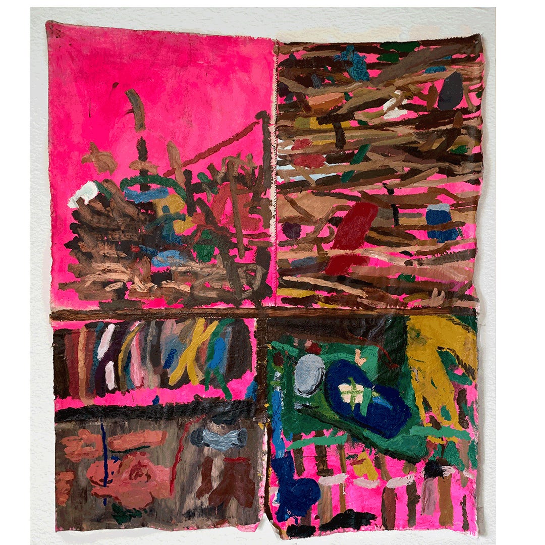
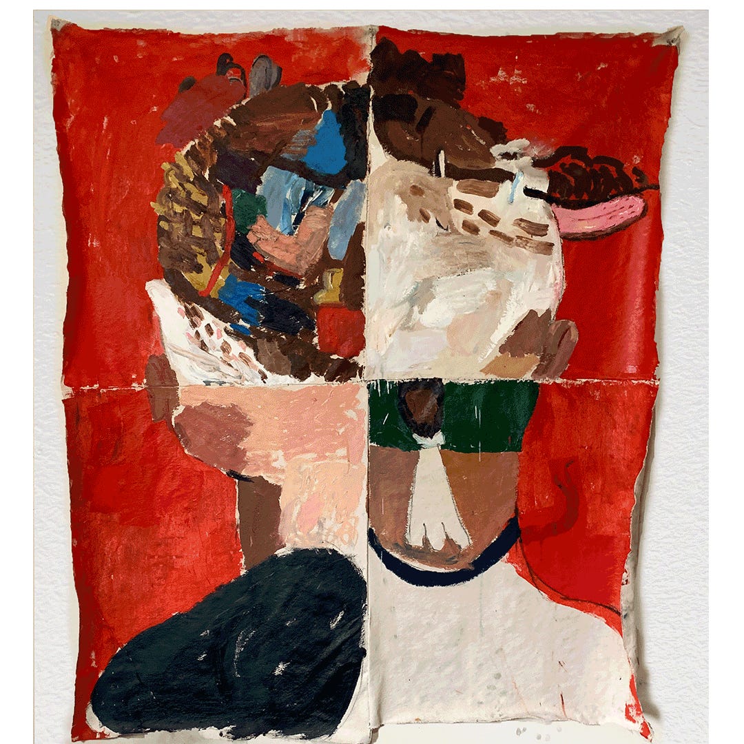
Title of Exhibition: Weaving Time
In my recent body of work, I build piles of banal objects that sit within joined pieces of canvas, pinned slackly on a wall. The work unfolds from unknown objectivity, weaving moments of fluidity, color, and boundaries. The image is one that simultaneously moves through several low end, rough languages in an abrupt patchy construction.
For more of Nikodem’s work:
Instagram: @nikodemadamski
Final Studies are in partnership with The University of Akron and are made possible with support from Fifth Third Bank and the Robert O. and Annamae Orr Family Foundation.
Read More

